Content hierarchy
Headings, descriptions and images create different reading levels, from an overview to product details.
For Axion Controllers I worked on the website, visual identity, all photography and image editing. The work also includes Instagram publications and Twitch graphics for players.
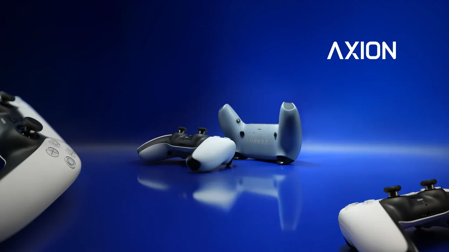
Axion builds custom controllers. The identity needs to identify the brand on a small product and guide technical choices online: the logo, hierarchy, colour and imagery work together.


The symbol combines four diagonal arms and four directional elements around an open centre. It evokes intersecting axes and controller inputs. The boards isolate parts of the original vector artwork to show how they come together.
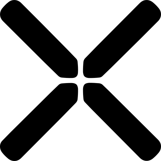
01 / Diagonal structure

02 / Four directions
03 / The complete mark
The proposed usage rule reserves at least one module x around the mark, where x is one eighth of the symbol width. The mark retains the same construction in positive and reversed monochrome versions.
Reduction study / 64, 40, 24 px
Deep navy supports the imagery and interface; lime identifies actions and selections, while off-white keeps text and data readable. On the website, the Inter sans-serif family organises headings, descriptions and technical information.
TAKE OVER.
TAKE CONTROL.
TAKE AXION.
I worked on the website as the meeting point of visual identity, photography and product information. The work covers page structure, content hierarchy and the adaptation of materials to digital formats.
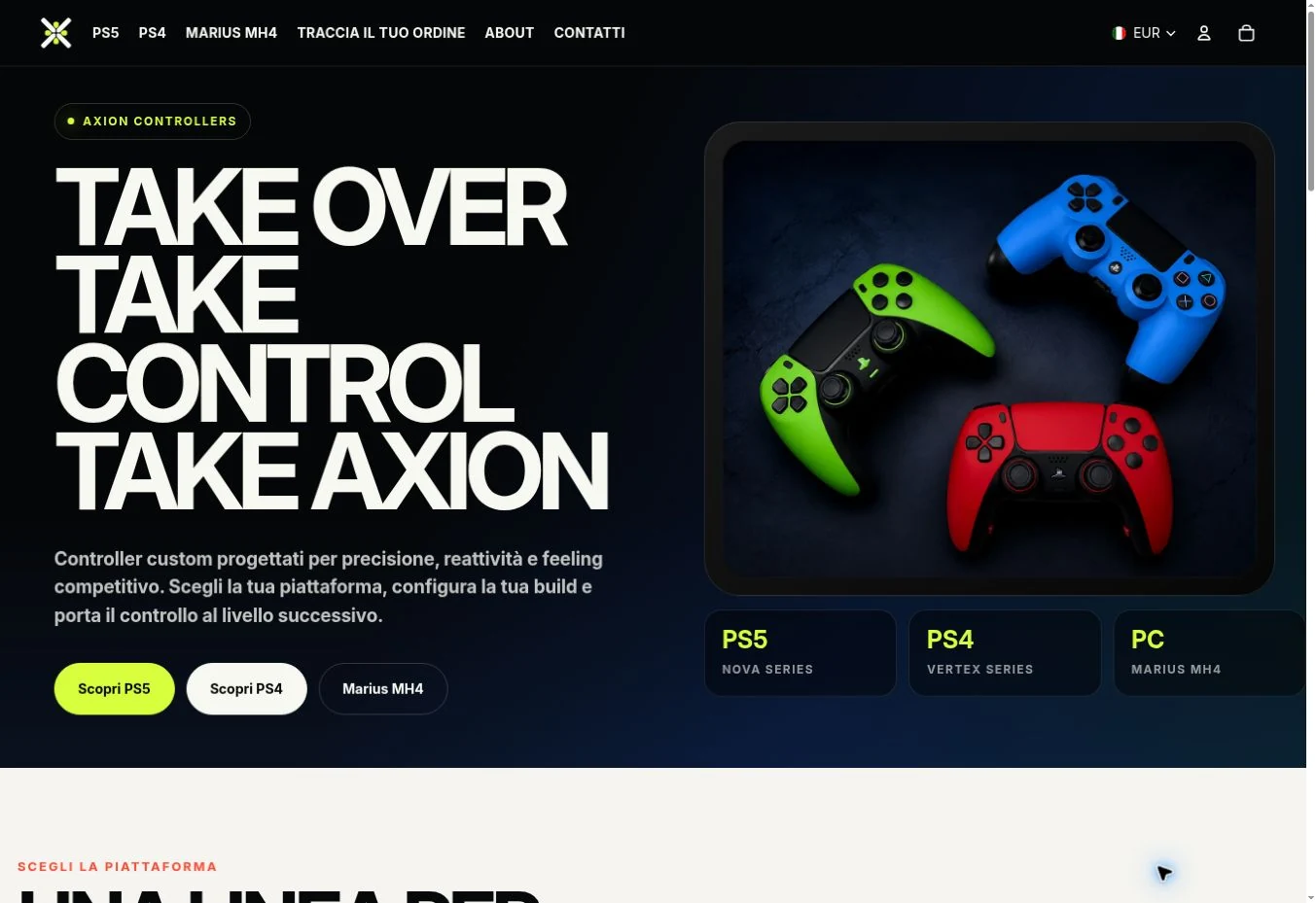
Headings, descriptions and images create different reading levels, from an overview to product details.
I integrated the photographs and their editing into the website, keeping framing, backgrounds and the identity palette consistent.
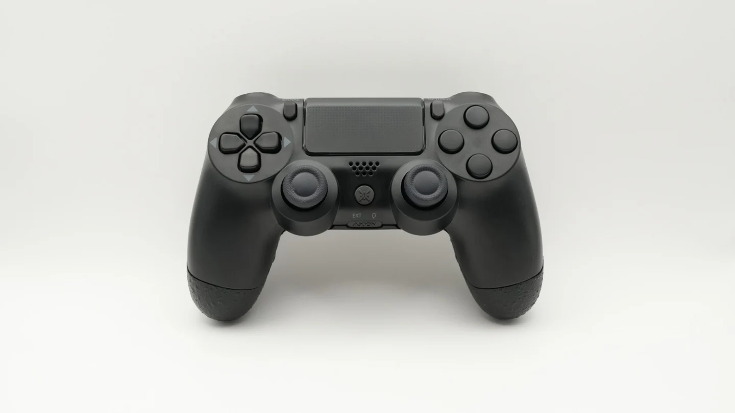
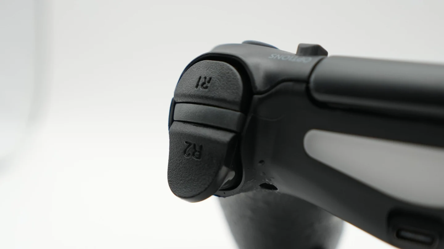
I shot all the product photography and handled selection, editing and the final image treatment. General views show the controller, while close-ups document the grip, rear inputs, triggers and finishes.
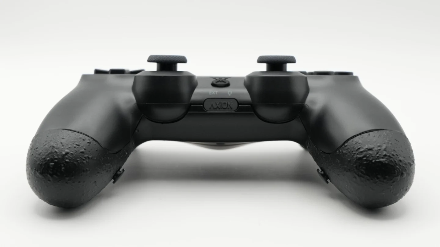
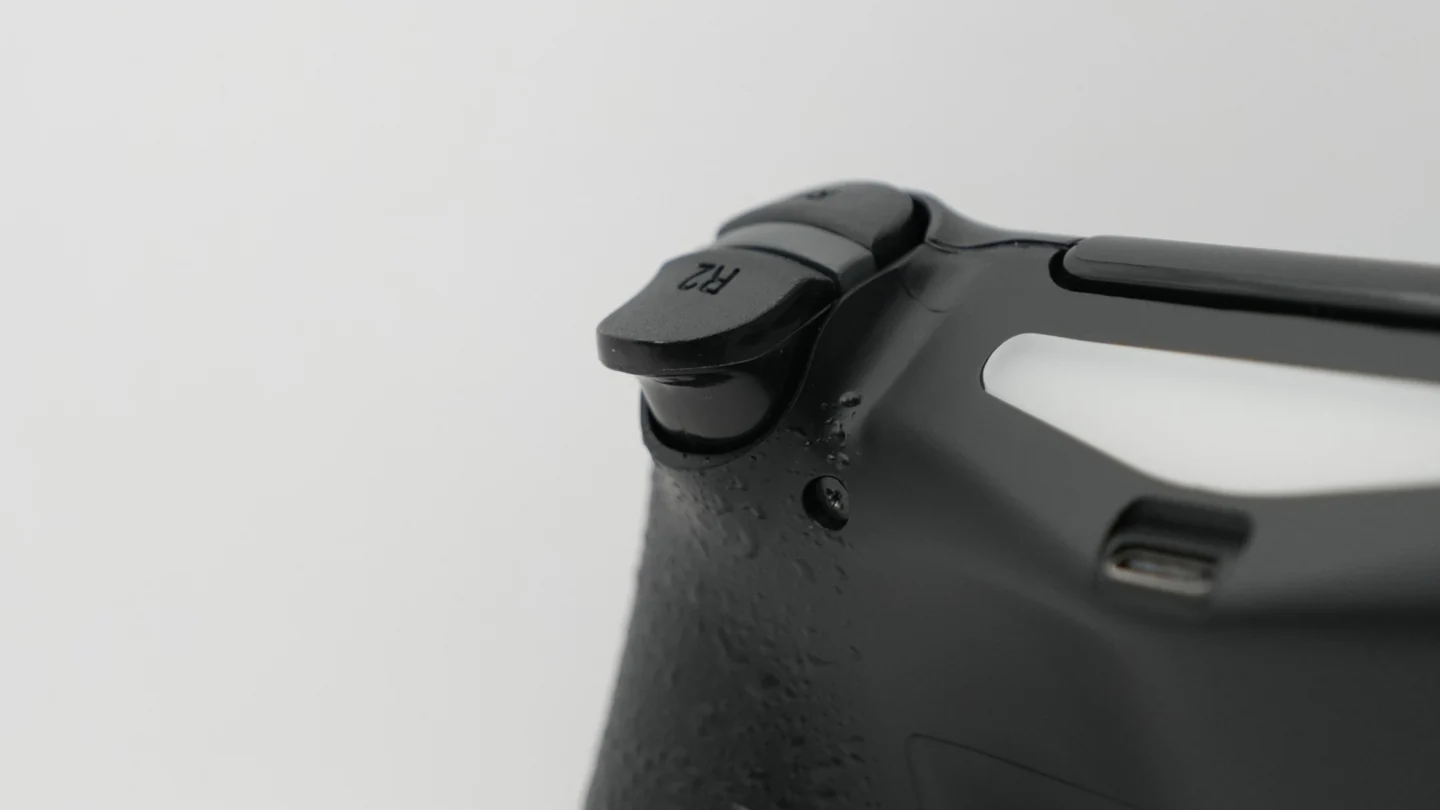
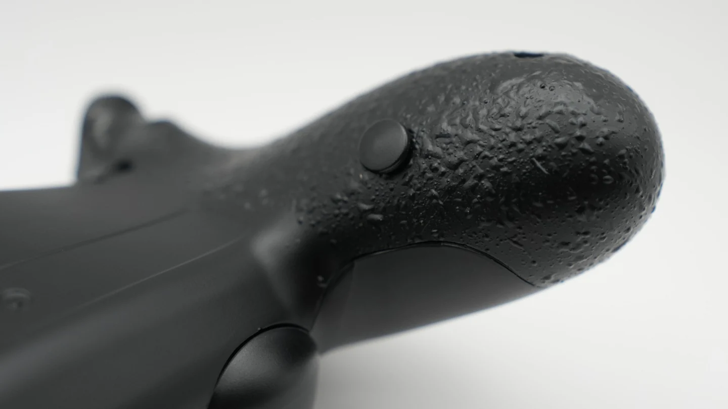
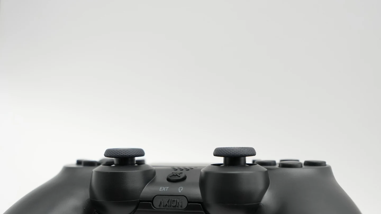
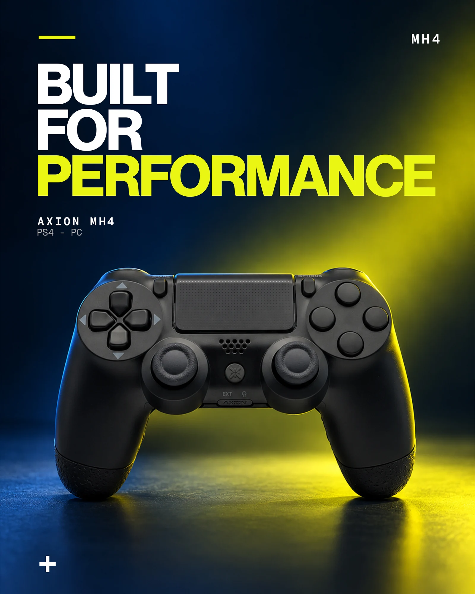
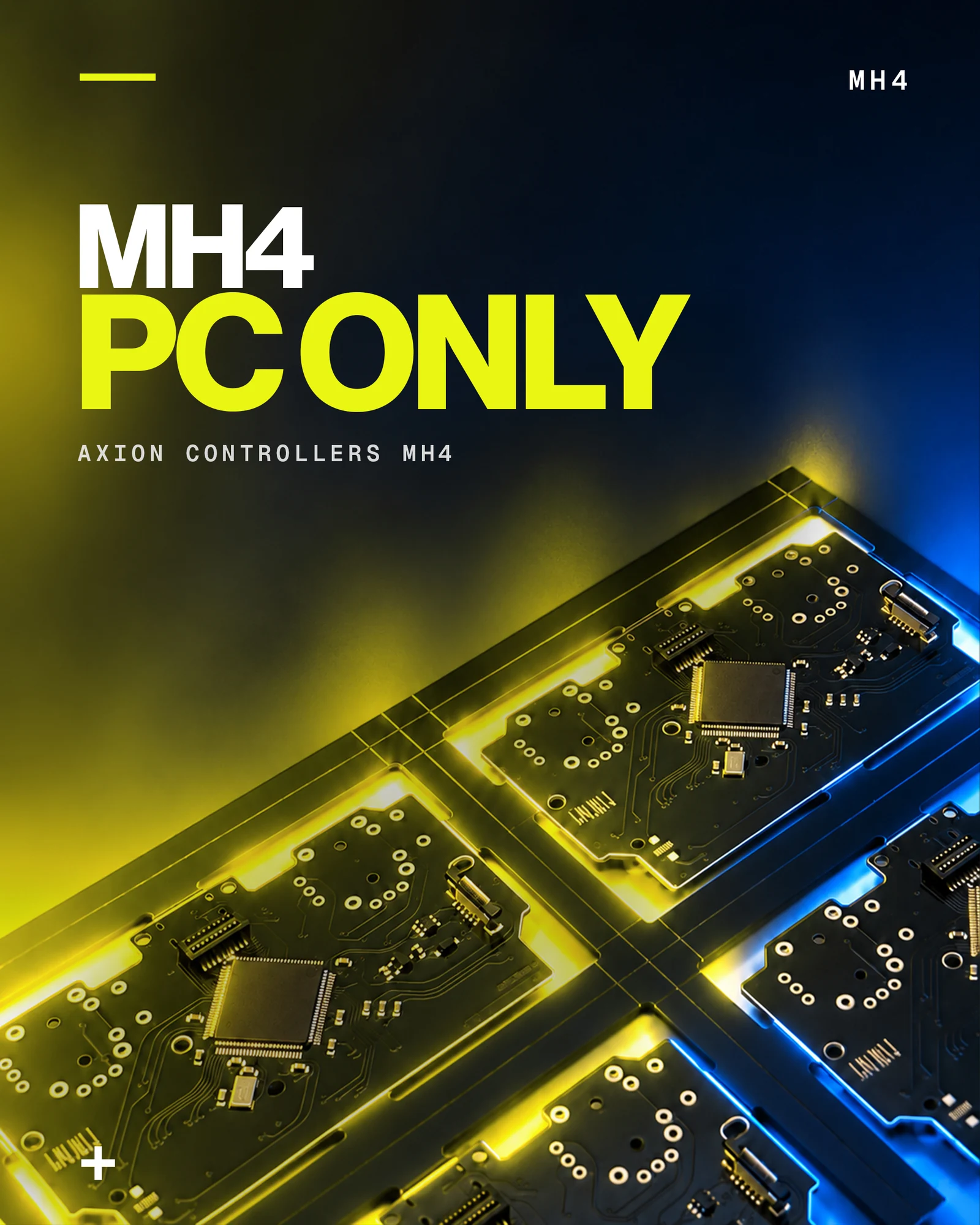
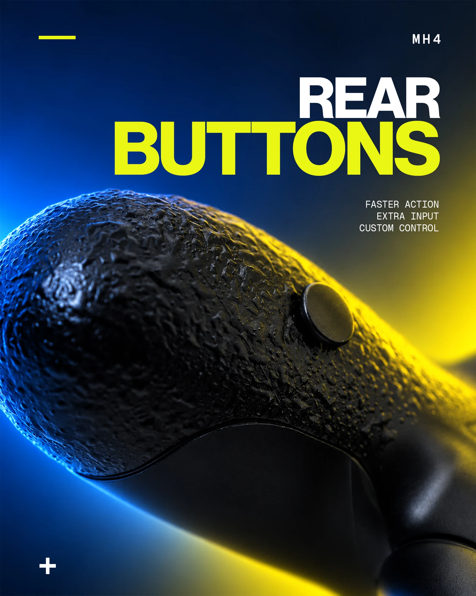
I designed Instagram publications to present models, components and updates. The MH4 campaign uses a sequence of subjects: controller, rear buttons, Smart inputs, sticks and USB-C connectivity. Headlines, colour and product details hold the series together.
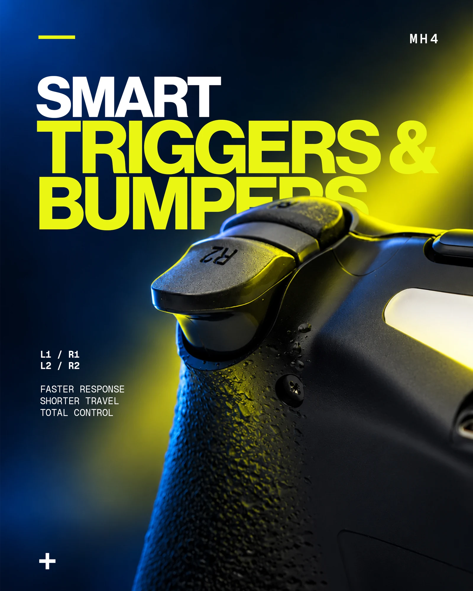
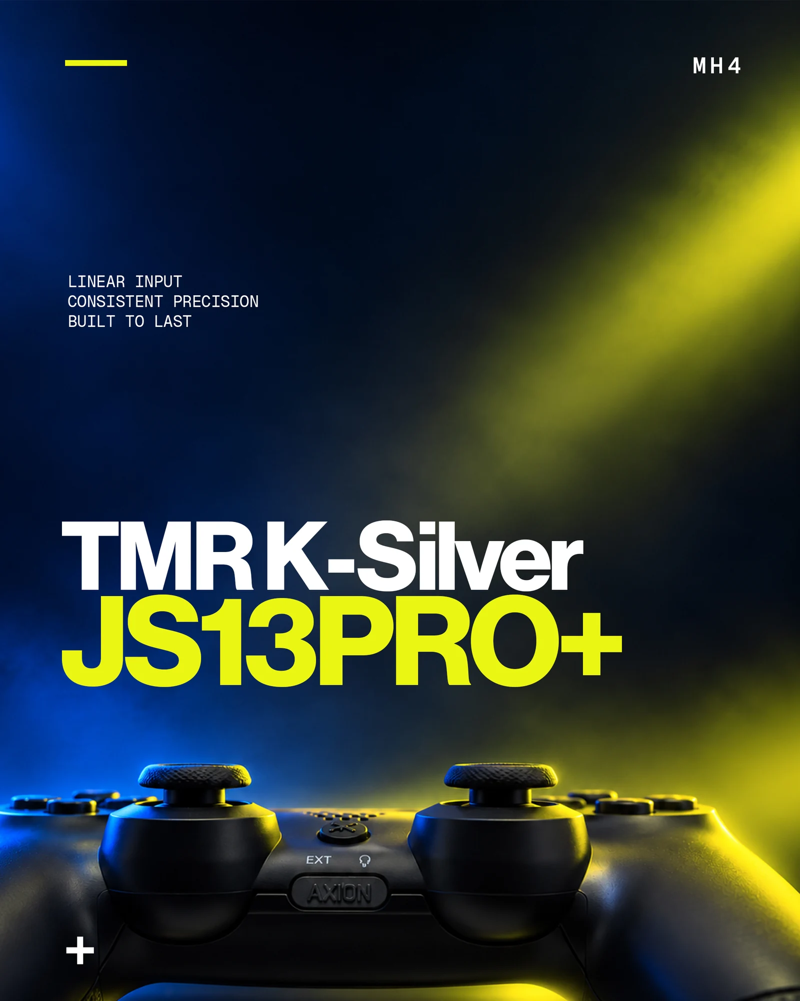
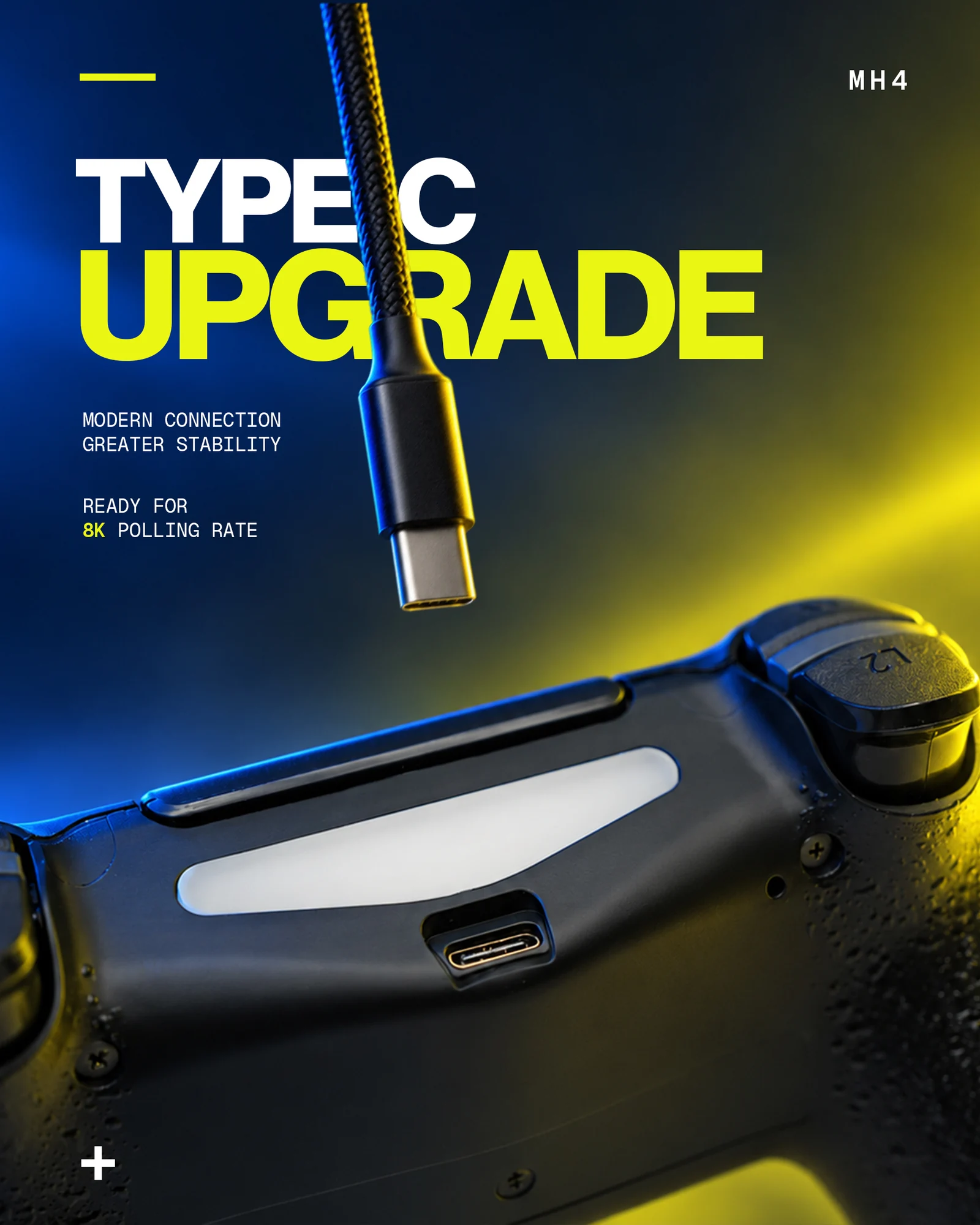
Player graphics bring Axion into Twitch channels: a static affiliate visual and an animated banner. New-colour announcements apply the same visual language to the vertical story format.
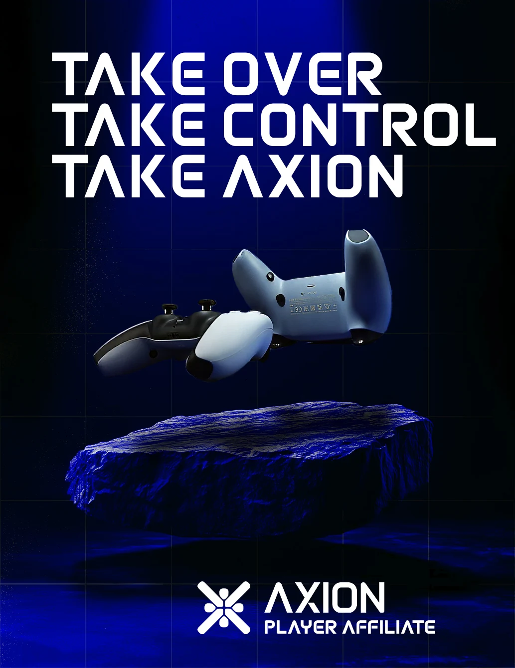
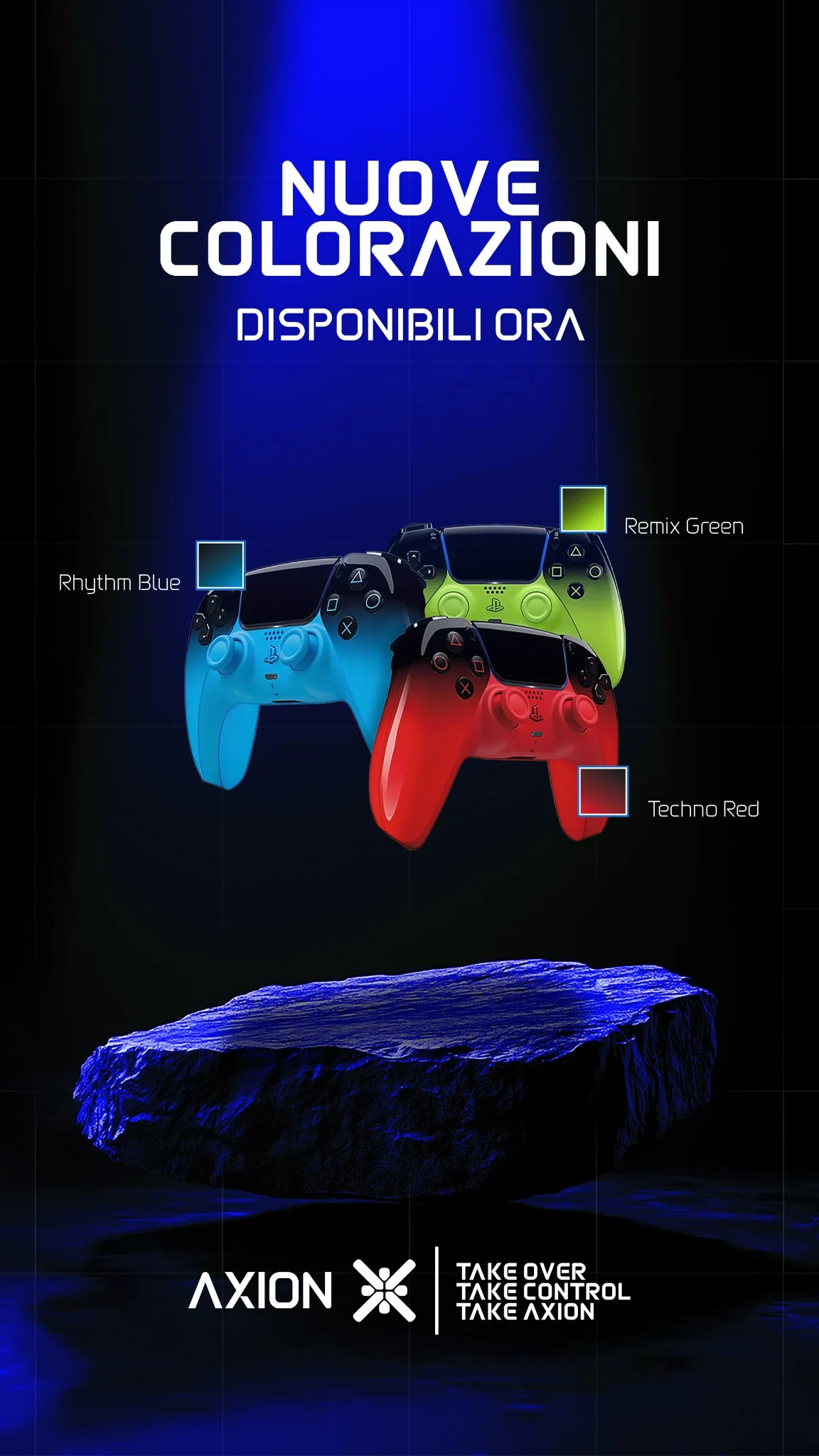
TWITCH / APPLICATION MOCKUP — ORIGINAL BANNER, DEMONSTRATION CHANNEL.
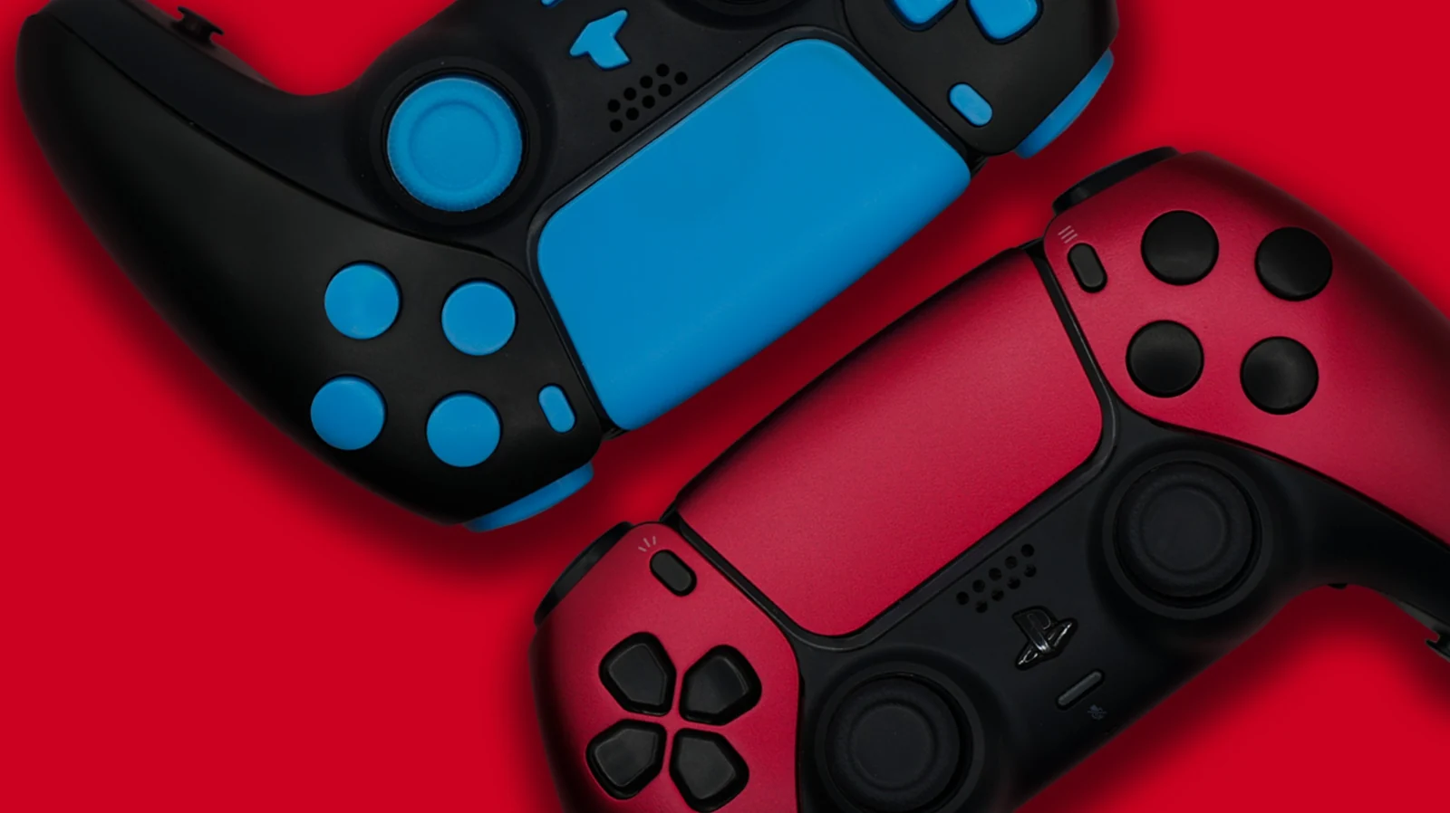
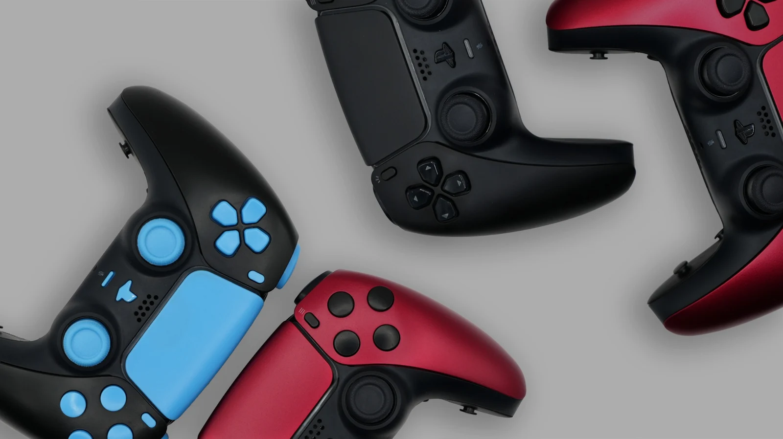
Website banners bring the product colour variants into horizontal compositions. Photography and editing keep surfaces and finishes recognisable across formats.
Experimental lettering derives the five letters of AXION from controller input shapes. The original composition becomes a display font with a dedicated interactive specimen.
Five letters derived from controller inputs. The web version preserves the curves, proportions and relationships of the original composition: A, X, I, O, N and space. Lowercase input uses the same uppercase forms.
Loading preview…