HARMONY
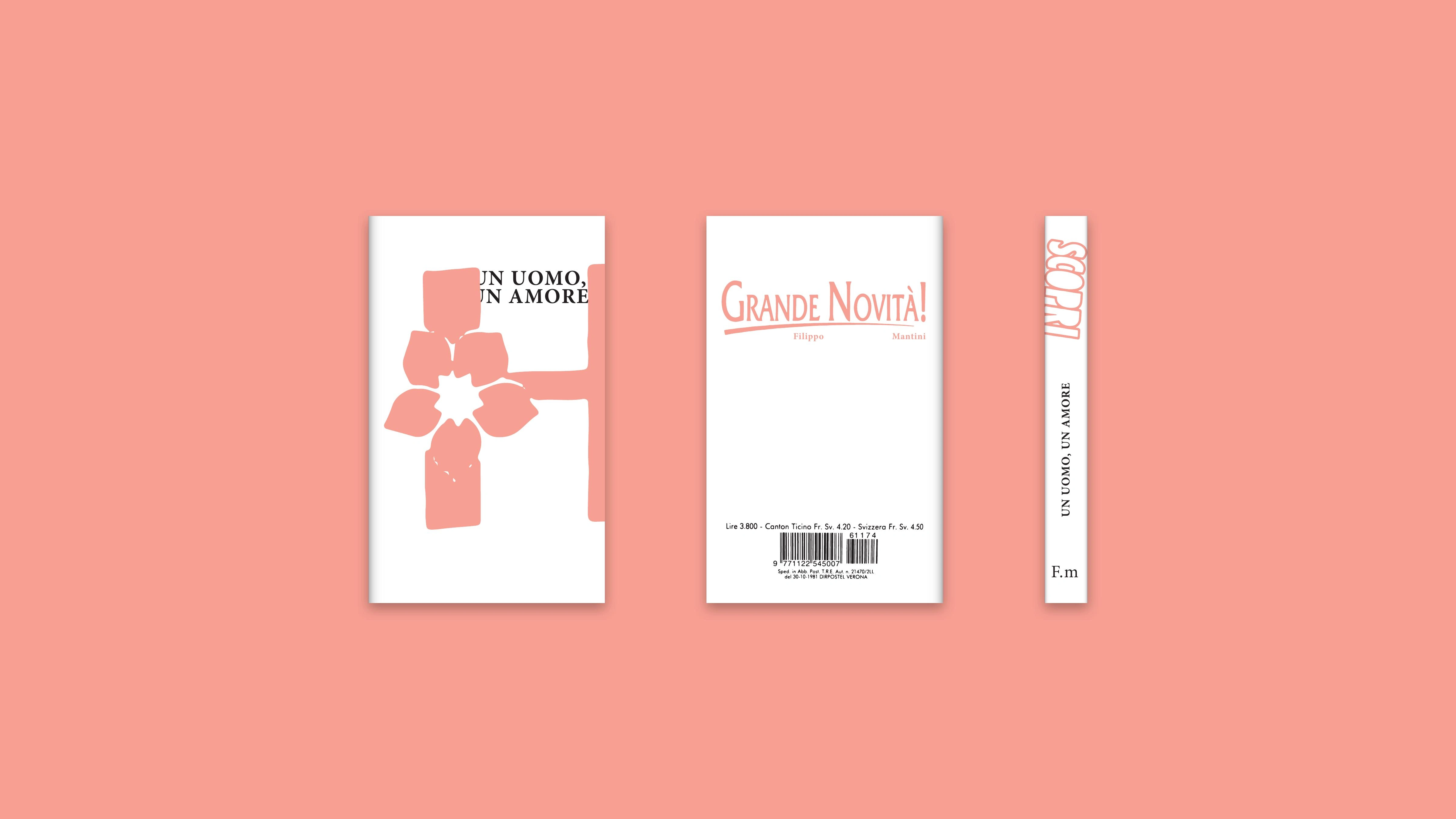
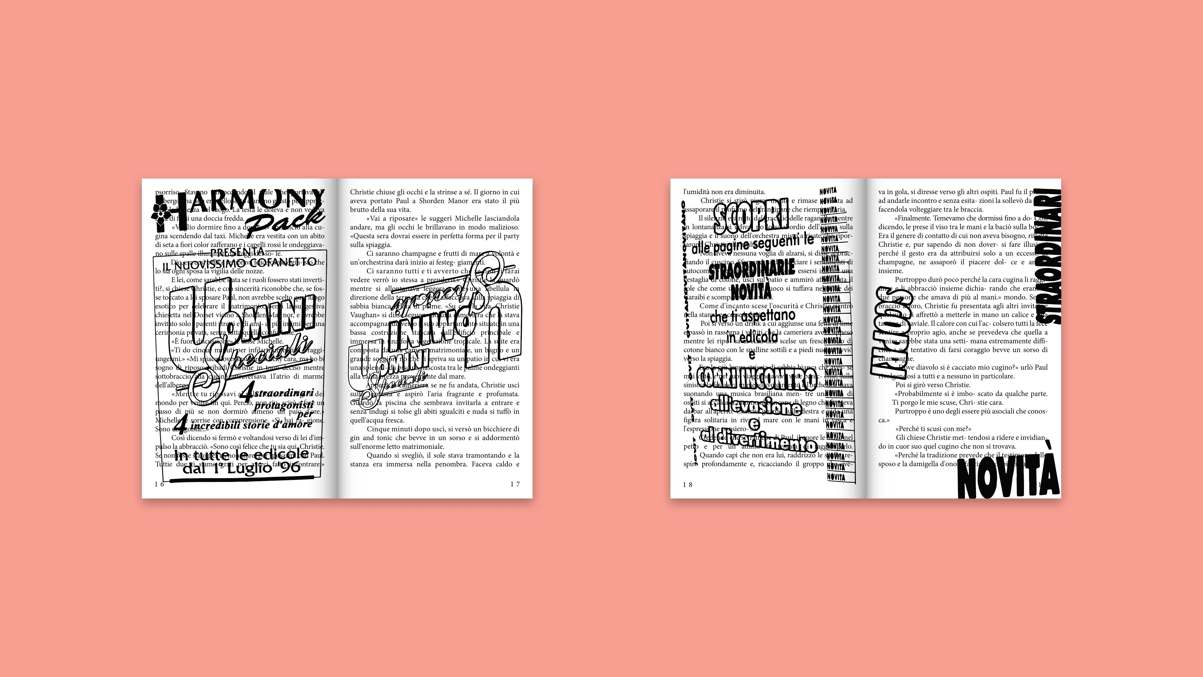
An editorial experiment exploring distraction within the reading experience by turning the advertising already present inside Harmony novels into an invasive visual system.
THE INTERRUPTION
WAS ALREADY THERE.
Harmony novels contain pages dedicated to advertising and promotion. These inserts interrupt the continuity of the story and temporarily move the reader away from the narrative.
The project begins from that existing interruption rather than introducing an unrelated graphic language.
SCAN.
VECTORISE.
INVADE.
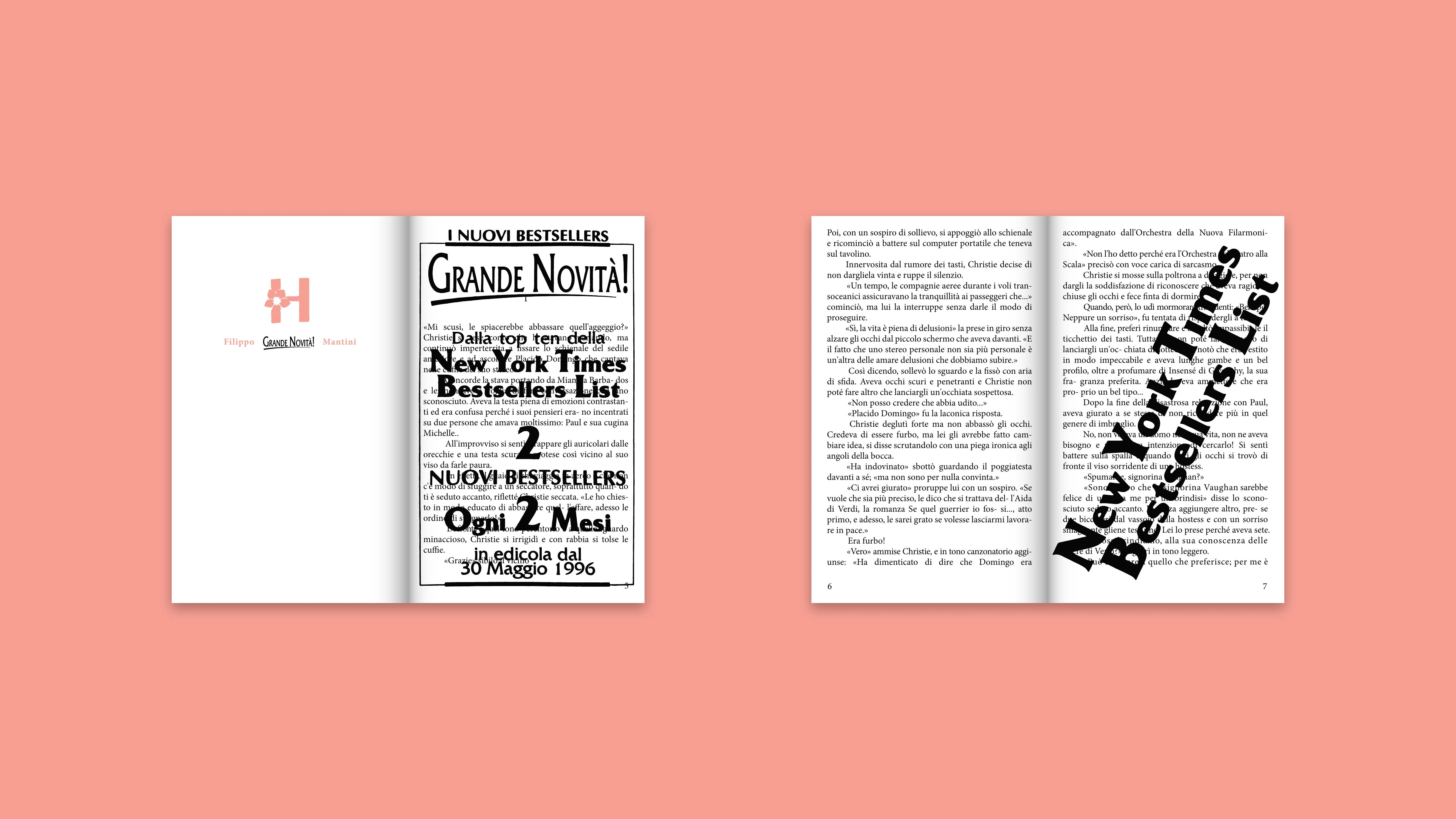
The original promotional graphics were scanned and vectorised, preserving the visual language of the source material.
They were then enlarged, fragmented and moved directly into the pages of the novel, progressively competing with the text instead of remaining confined to advertising sections.
DISTRACTION
AS A VISUAL LANGUAGE.
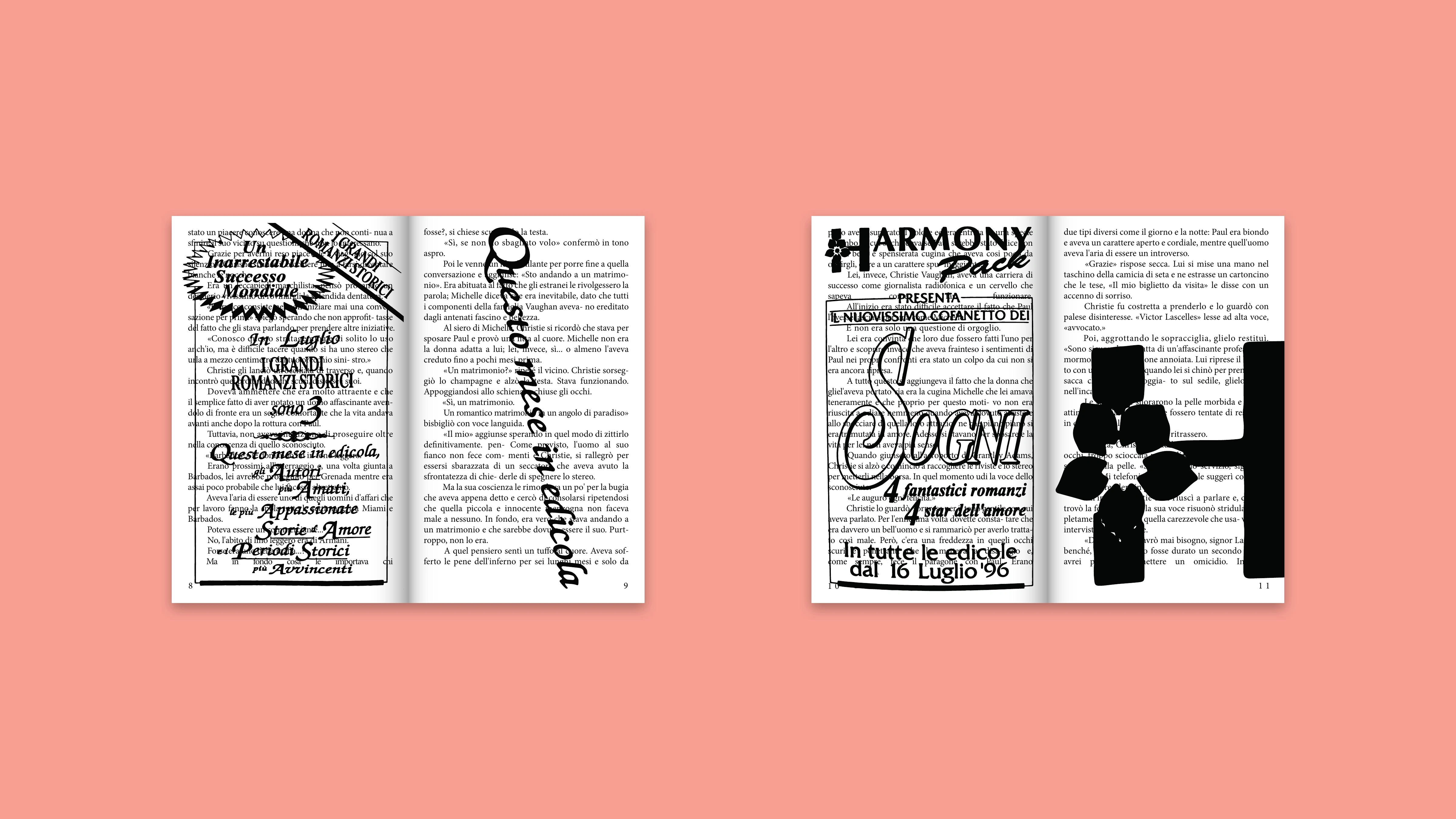
The deeper the reader moves through the project, the less stable the hierarchy becomes. Promotional headlines, symbols and commercial language begin to occupy the same space as the story.
Distraction is no longer described: it is experienced through the composition itself.
THE PAGE
LOSES FOCUS.
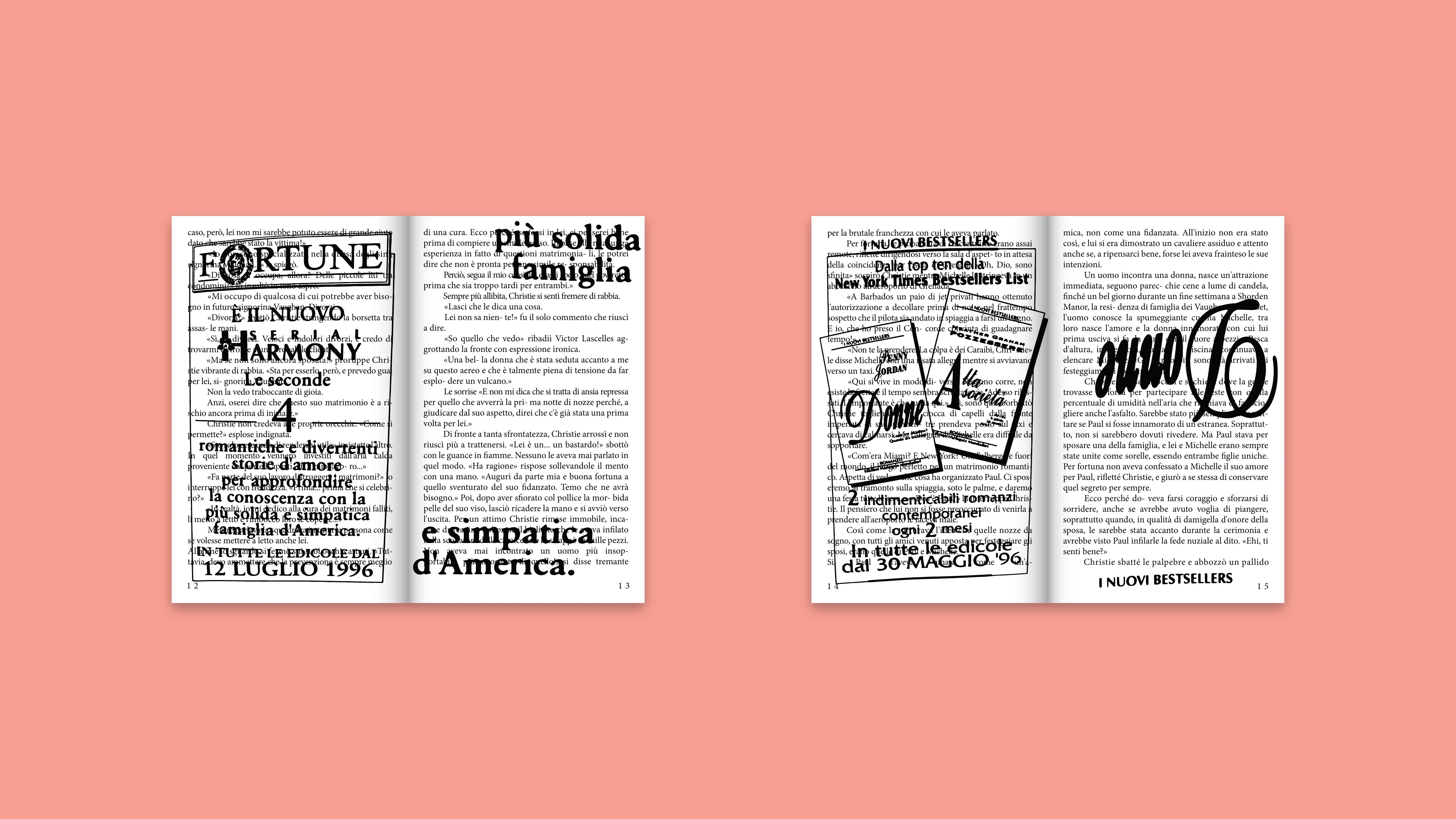
The final book turns a familiar reading object into a study of attention. Narrative and promotion coexist until the distinction between content and interruption becomes unstable.
What was once placed between parts of the novel now enters the story itself.
PROJECT CREDITS
- Visual research and editorial design
- Filippo Mantini
- Source material
- Harmony novels and promotional inserts