AZIENDA PIÙ SRL
A brand restyling and digital experience for Azienda Più SRL, developed to give the insurance broker a more contemporary, recognisable and versatile identity across physical and digital touchpoints.
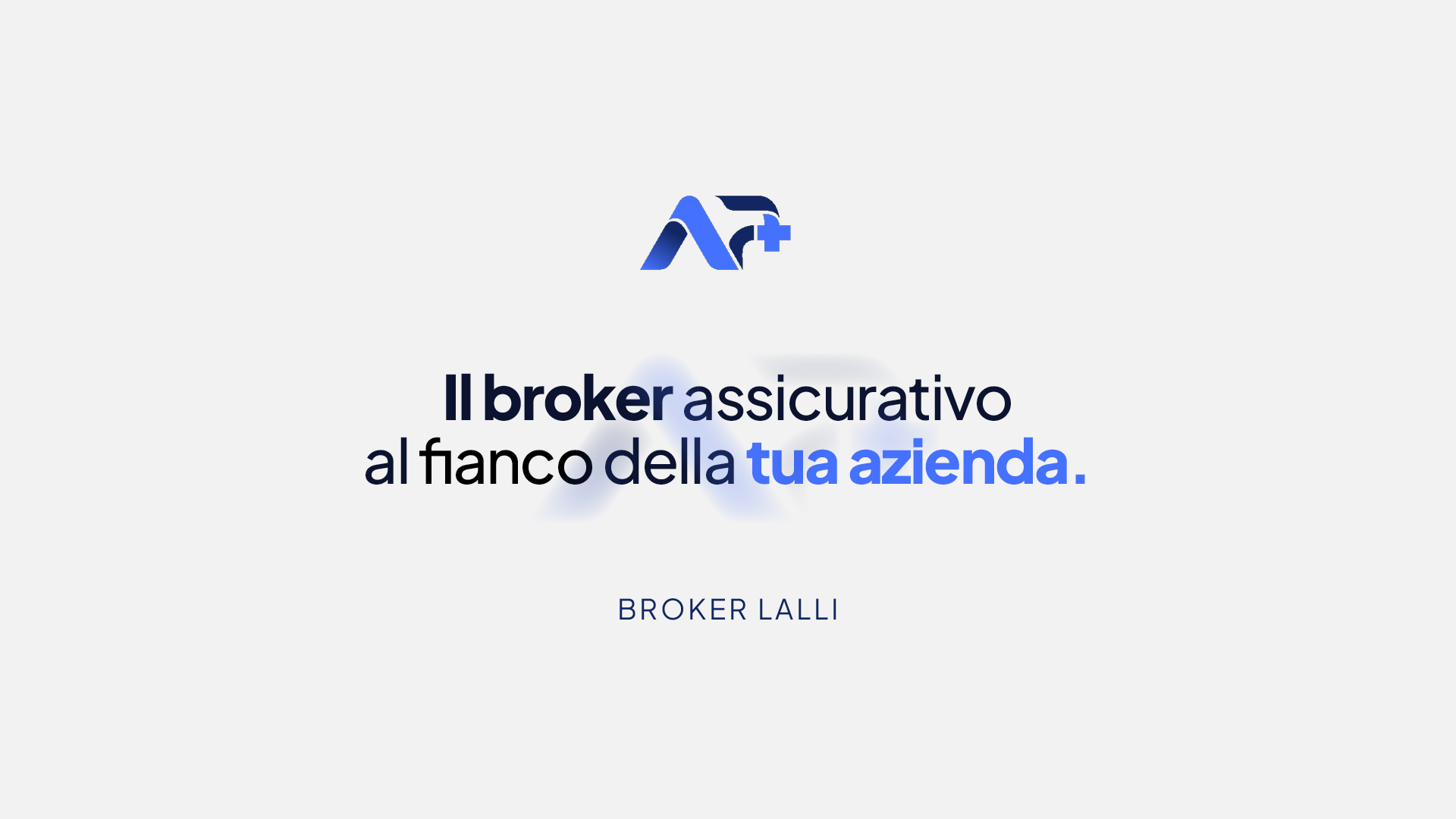
A short sequence introducing Azienda Più’s new visual language through the brandmark, typography and the atmosphere of the website in motion.
at the side of
your company.
A MORE
CONTEMPORARY IDENTITY.
The project began with the need to transform the previous mark into a more contemporary, recognisable and versatile identity without losing clarity or trust.
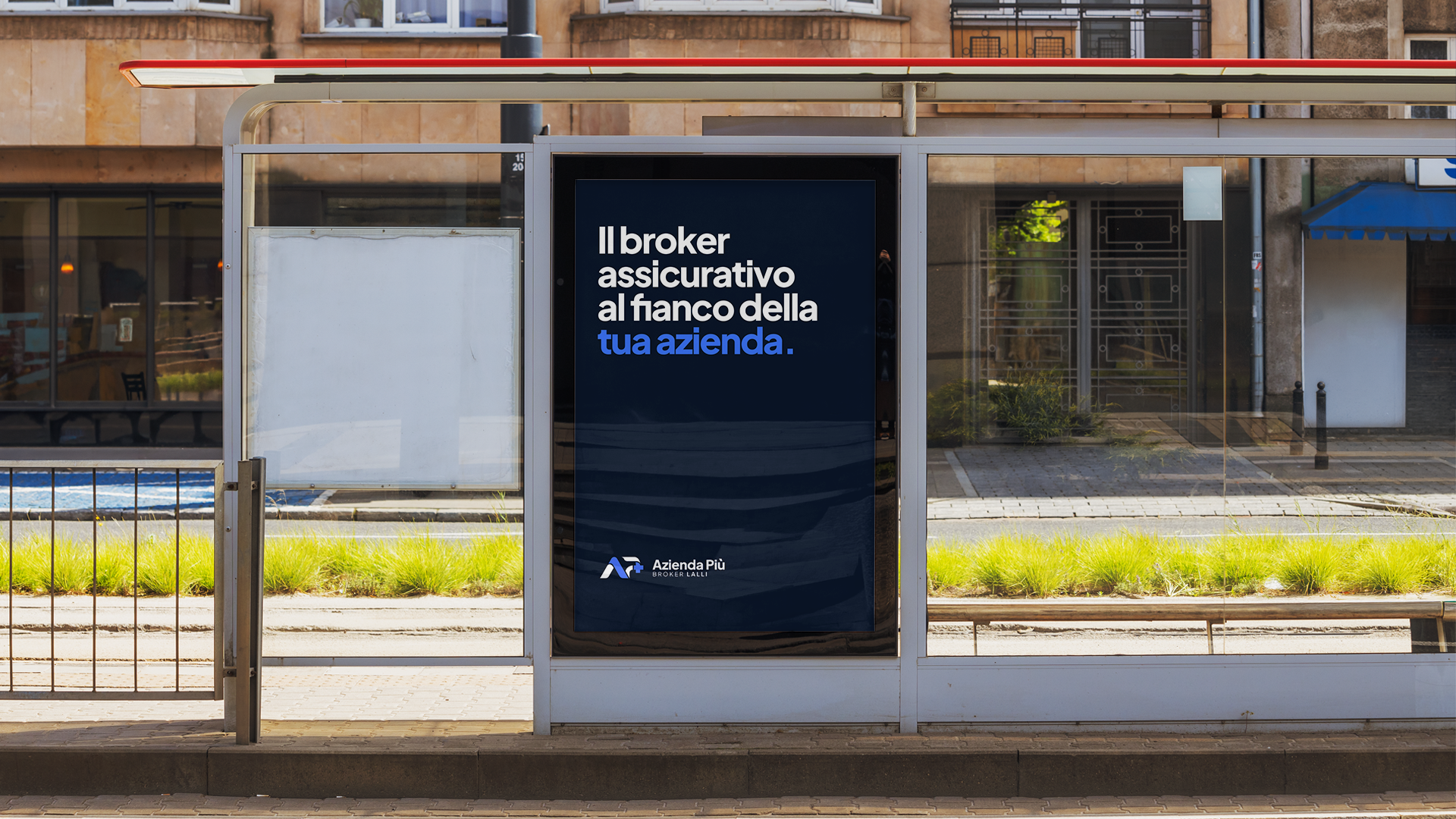
The system was developed to create consistency across physical and digital applications, from institutional communication to the web experience.
A + P
+ PLUS.
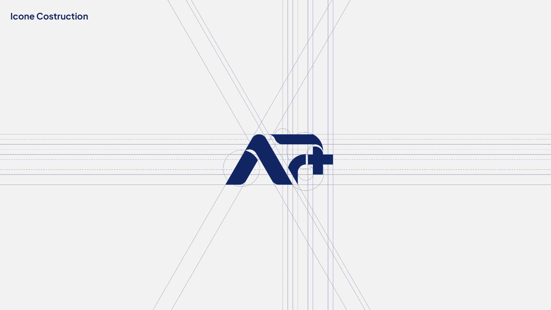
The new brandmark geometrically combines A, P and the “+” symbol into one autonomous, proprietary sign. The plus becomes part of the structure rather than an added element.
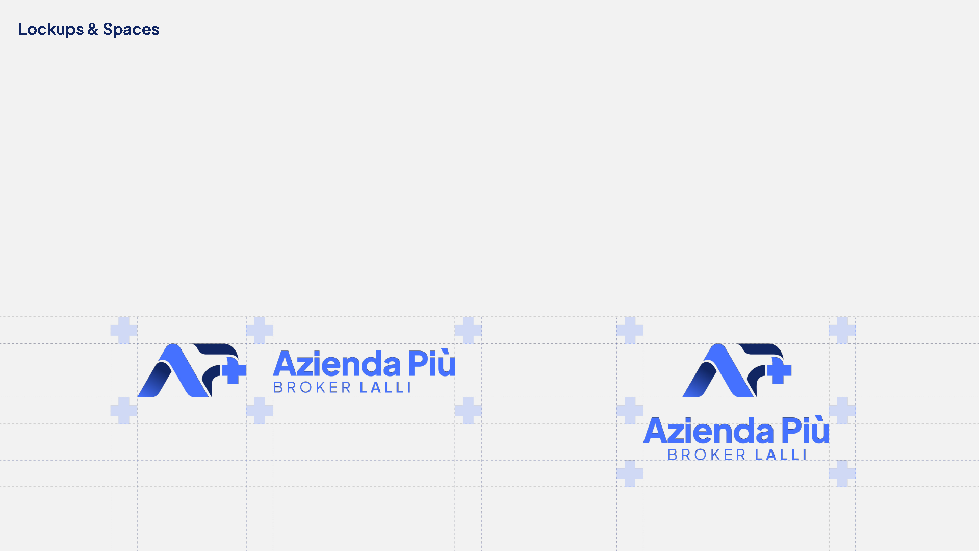
The system is designed to work both as an independent symbol and within the full Azienda Più Broker lockup.
COLOR AS
STRUCTURE.
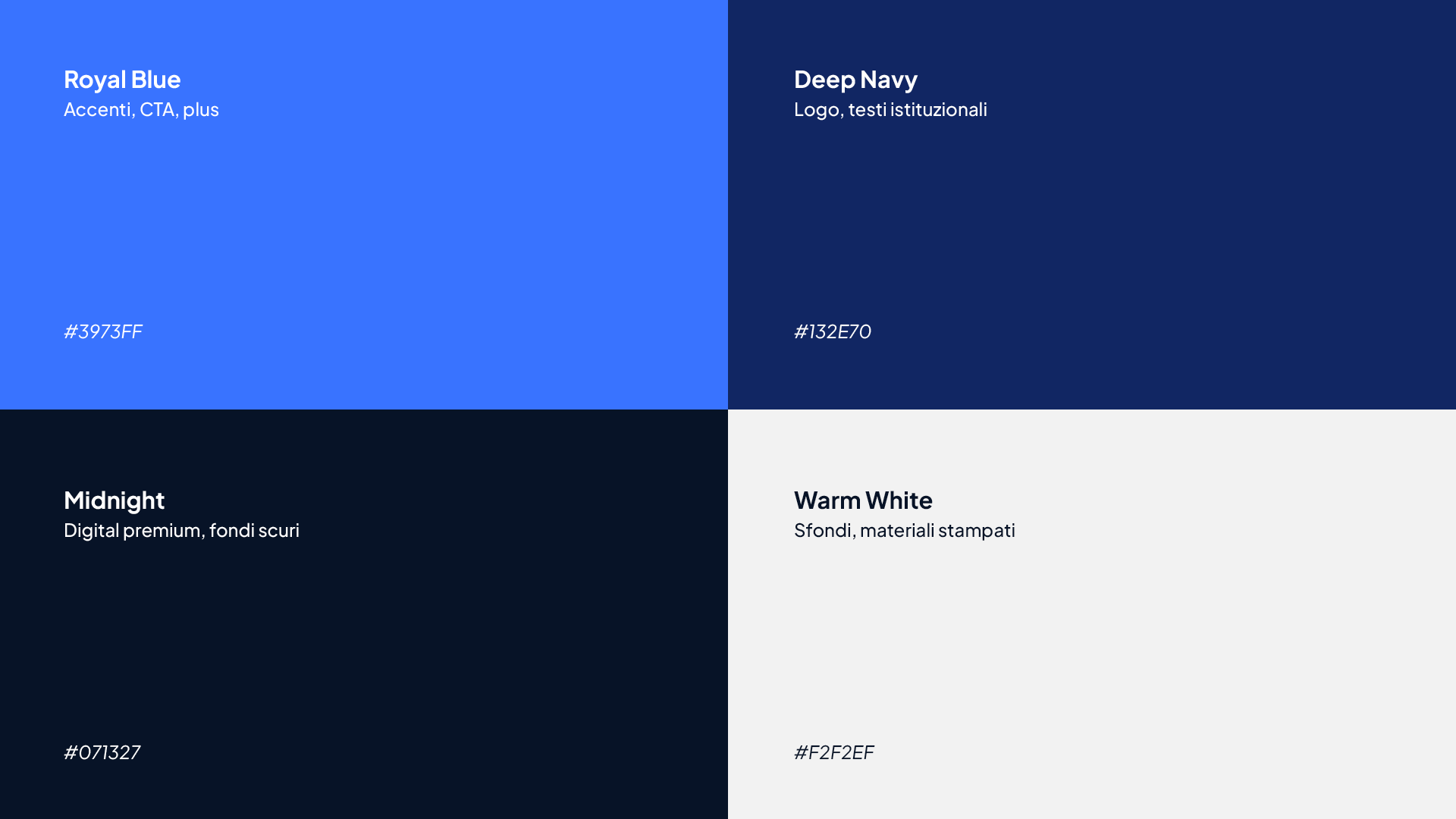
The palette is built around the contrast between deep and bright blues, with clear roles across institutional communication, accents, calls to action and digital backgrounds.
Royal Blue, Deep Navy, Midnight and Warm White allow the system to retain the same visual voice across different media.
IDENTITY BECOMES
INTERFACE.
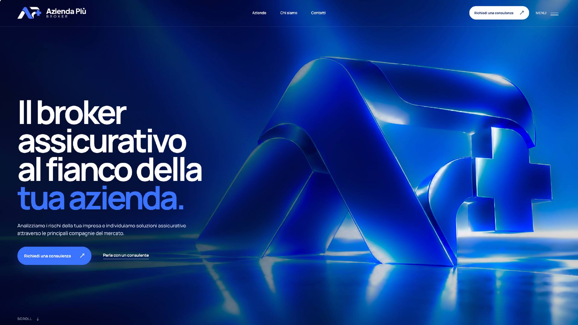
The website brings the visual system into a more direct digital experience: large typography, deep backgrounds, bright accents and a hierarchy built around the relationship with the client company.
Web design is not treated as a separate application, but as a continuation of the identity.
THE SYSTEM
IN MOTION.
Animations, transitions and responsive behaviour are part of the website language. Motion supports navigation without separating itself from the graphic system.
The videos show the project in its actual behaviour rather than only as a sequence of static screens.
FROM SYSTEM
TO USE.
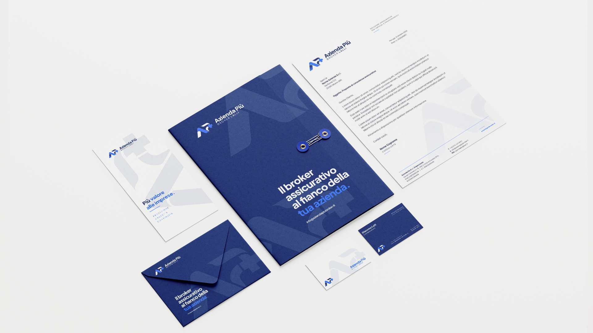
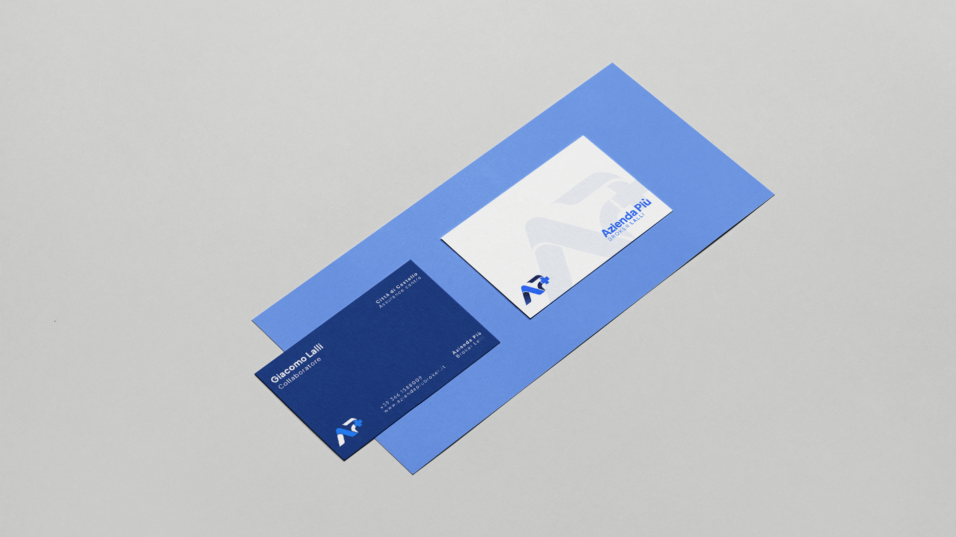
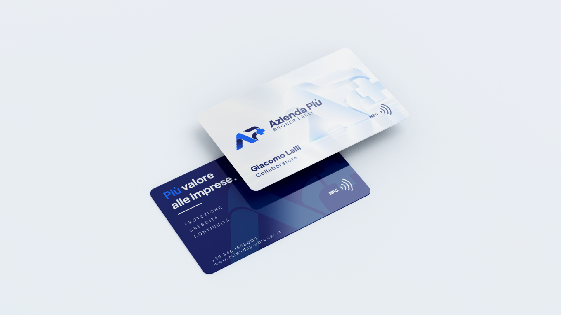
The identity extends into stationery, business cards and NFC cards while preserving the relationship between brandmark, typography, blue and white space.
The applications show how the same system can change scale and material without losing recognition.
PROJECT CREDITS
- Visual identity and web design
- Filippo Mantini
- Project for
- Azienda Più SRL / Broker Lalli