NO FONT
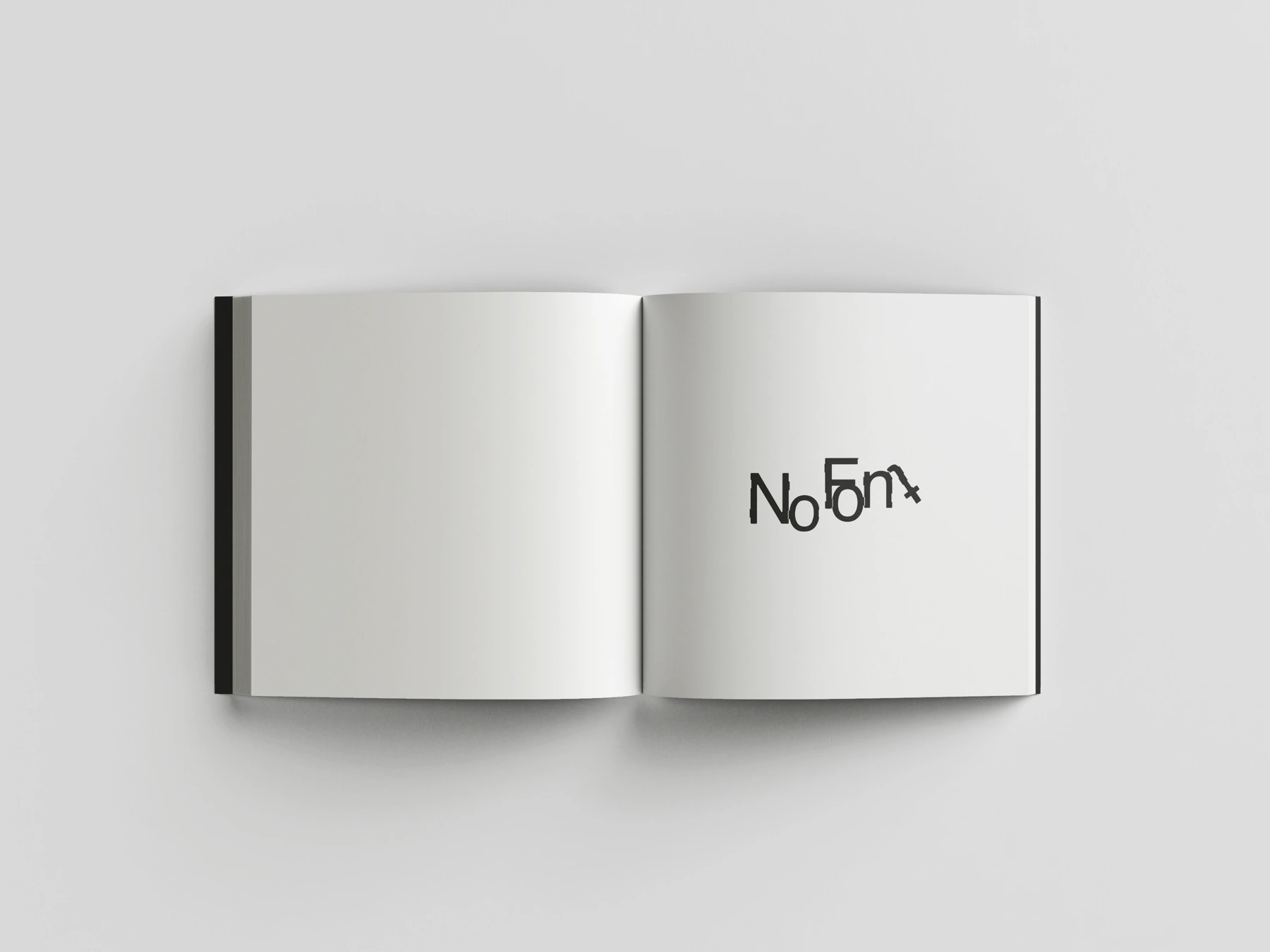
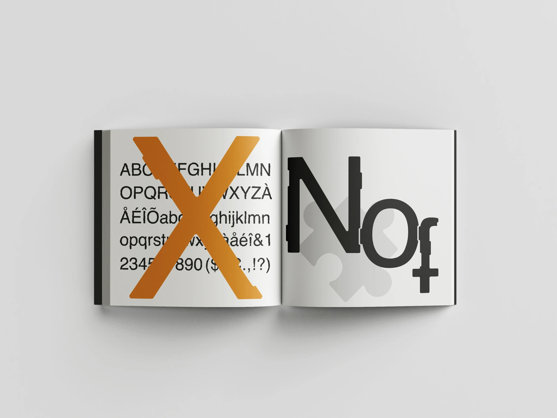
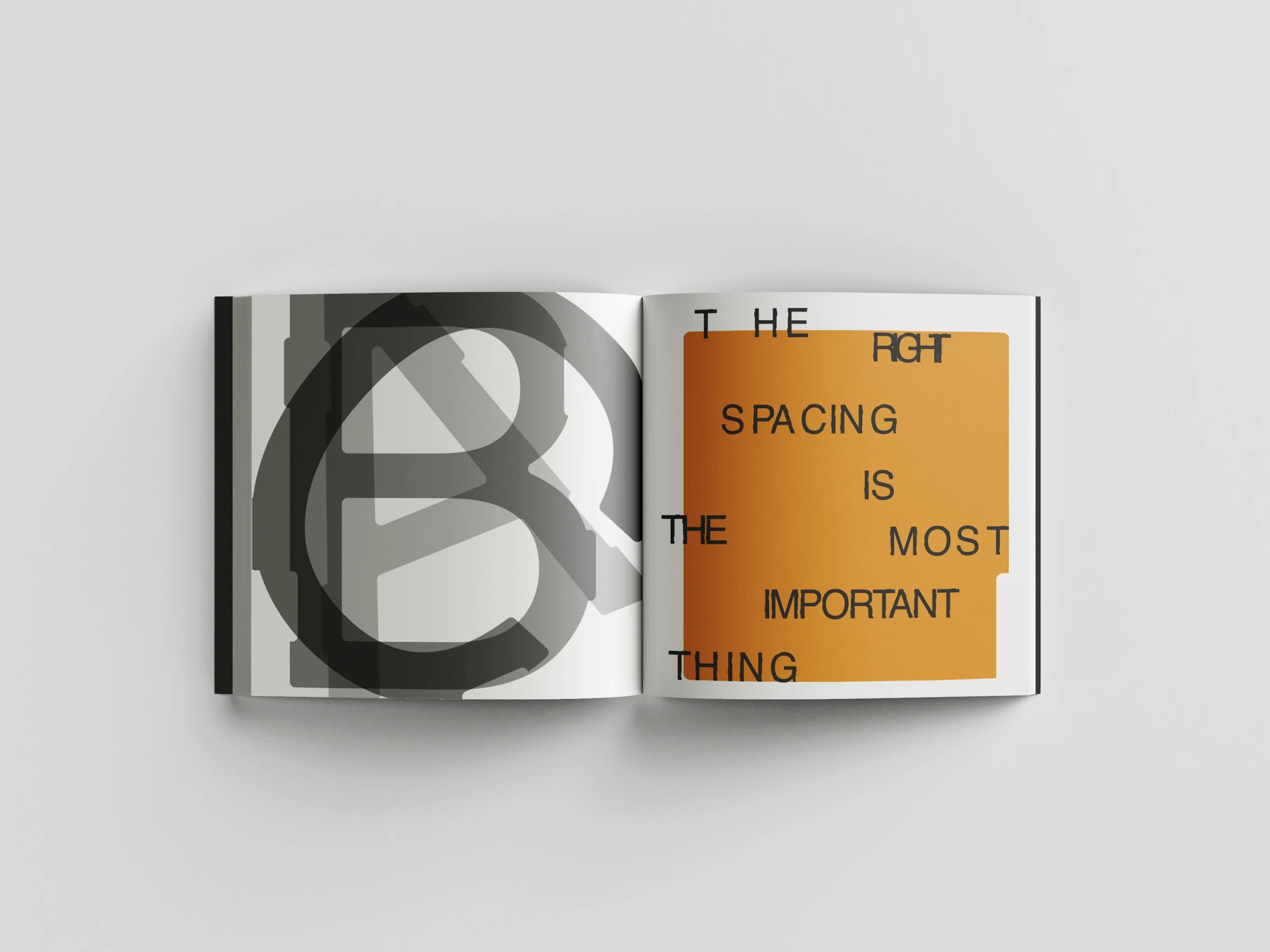
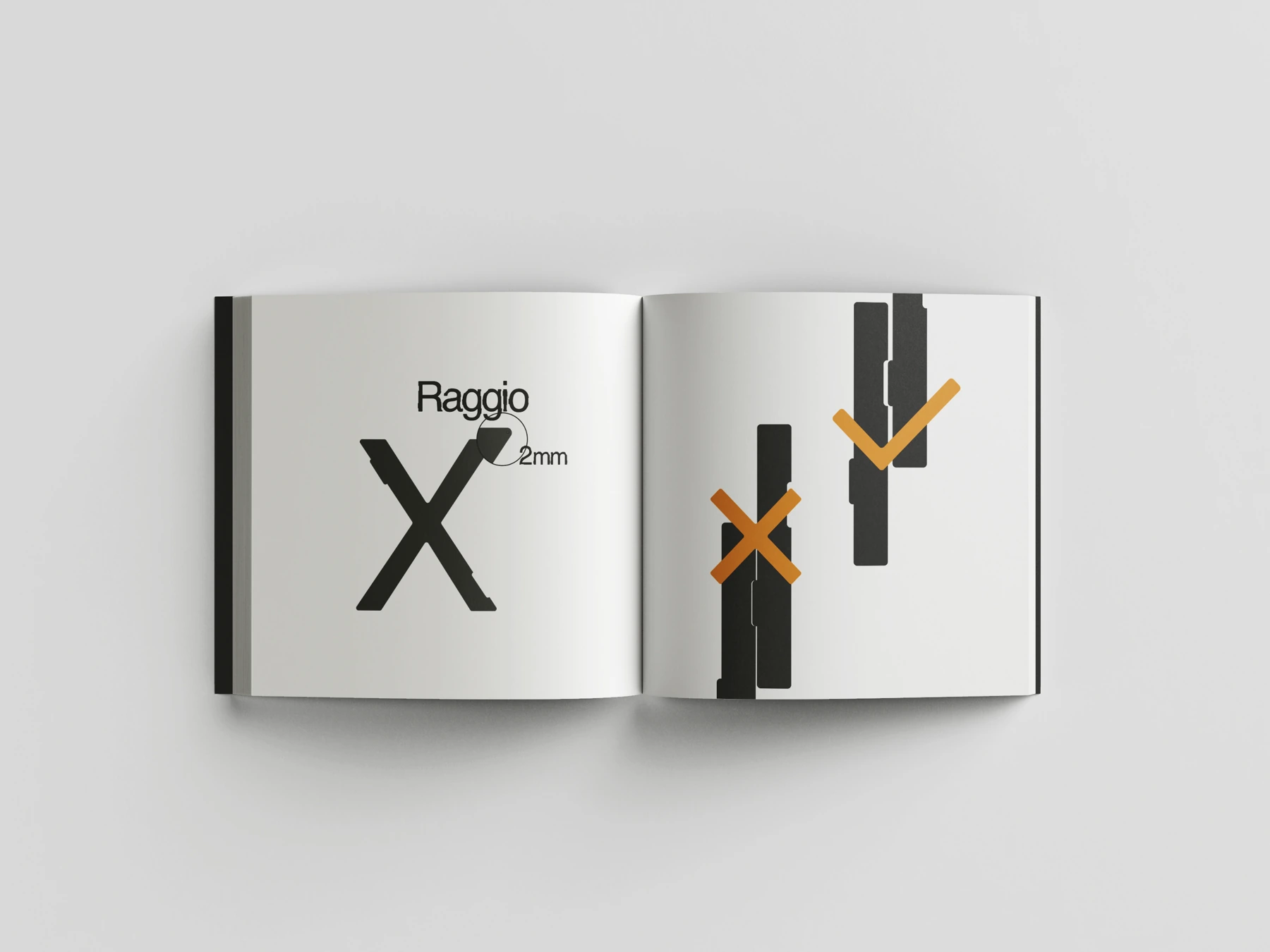
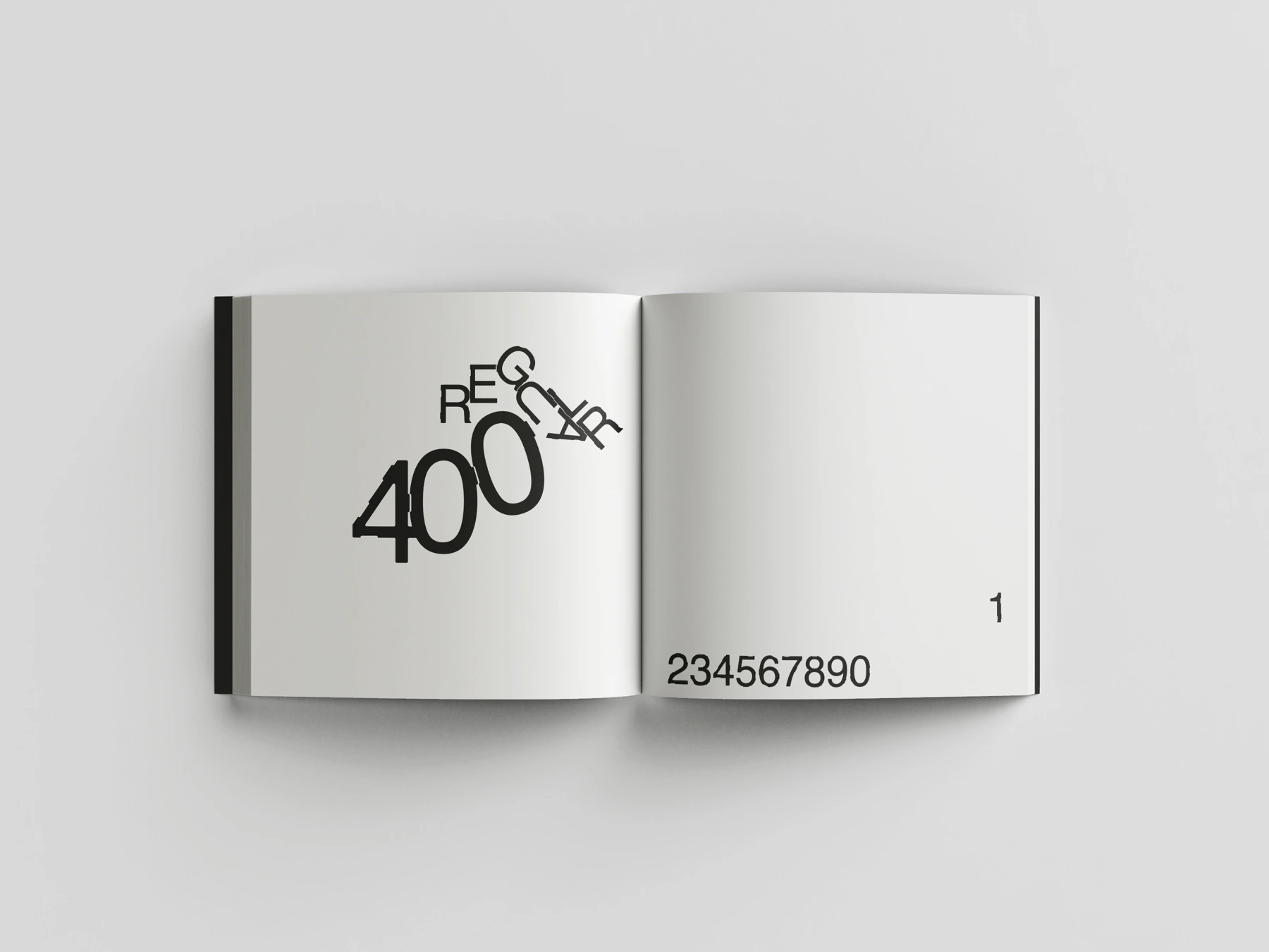
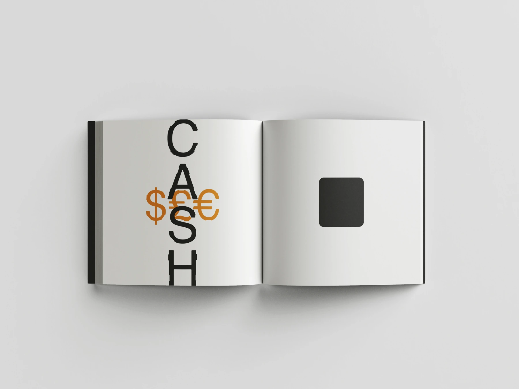
No Font explores letter construction, spacing and composition. The specimen brings together studies of shapes, weights and relationships between characters.
ONE LETTER.
MORE POSSIBILITIES.
I took the narrative structure of Mr. Nobody as a starting point: the protagonist’s choices open up parallel stories. No Font brings this idea into typography, allowing the same letters to produce different readings.
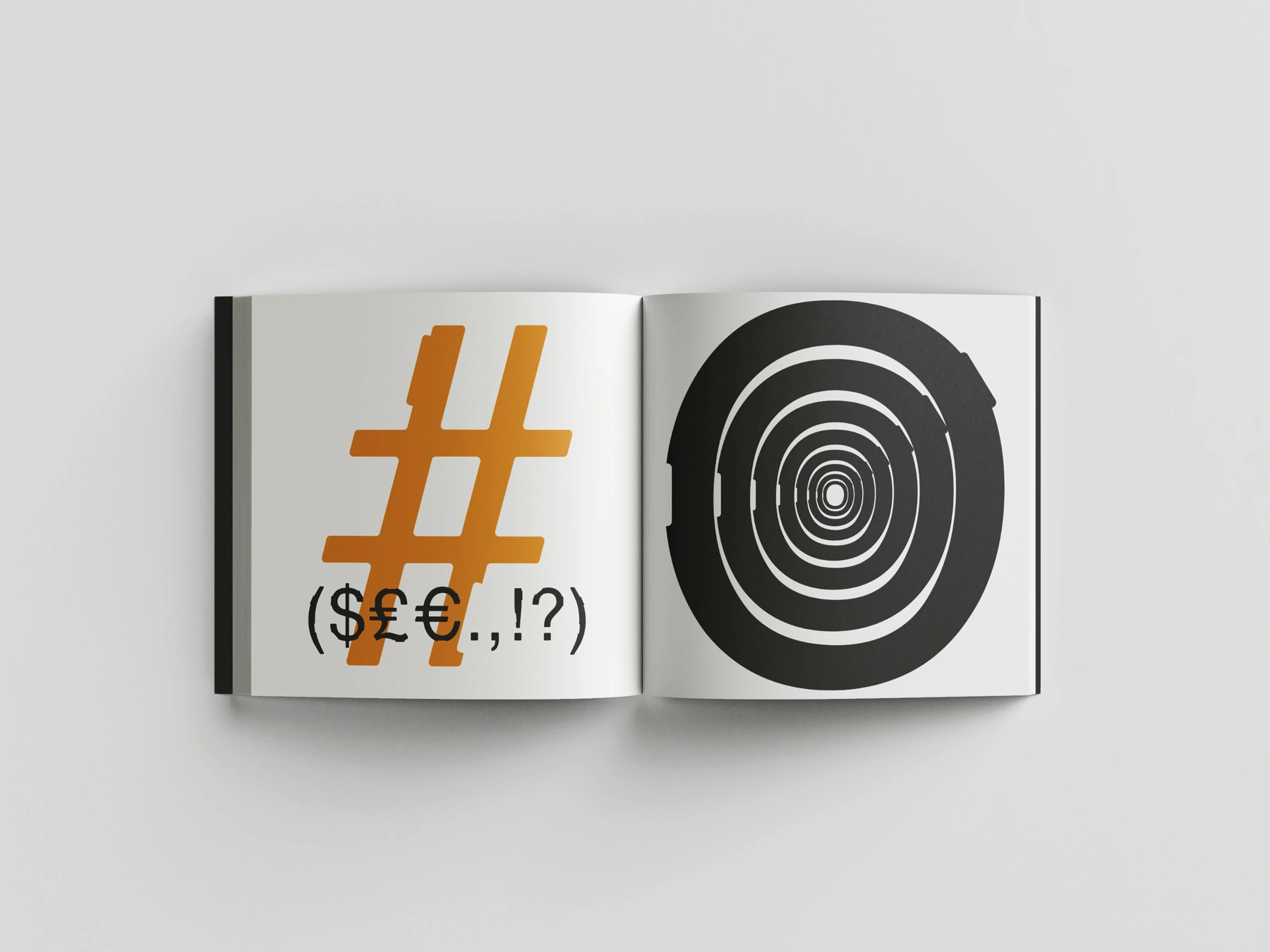
Cuts in the letterforms become interlocking points. Regular spacing keeps the alphabet readable; bringing glyphs closer, rotating and overlapping them turns text into an open composition. The specimen explores these possibilities through letters, numerals and signs.
Try No Font
A web prototype converted from Filippo Mantini’s original outlines: uppercase, lowercase, numerals and the signs shown in the specimen. Initial spacing; kerning needs refinement. Unsupported characters are indicated.
Loading preview…
PROJECT CREDITS
- Type design and editorial specimen
- Filippo Mantini