CITTÀ DI
CASTELLO
A proposed visual identity for Città di Castello, built around the city's cultural relationship with Alberto Burri. The project translates forms found in his work into a civic mark, a custom alphabet and a flexible visual language.
CASTELLO
THE CITY AS
A STARTING POINT.
The project began with a simple question: how can a city be translated into a recognisable visual identity? The aim was to create a shared system capable of connecting institutions, culture and public communication through one coherent language.
Rather than designing a single logo, the proposal develops a visual system that can adapt to different areas of city communication while maintaining continuity and recognition.
CAN A CITY’S IDENTITY
GROW FROM THE FORMS
OF ITS CULTURE?
The proposal begins with the idea of building a visual language from the artistic heritage of Città di Castello. The project takes shape through the relationship between the city and Alberto Burri, turning that connection into the starting point for the identity.
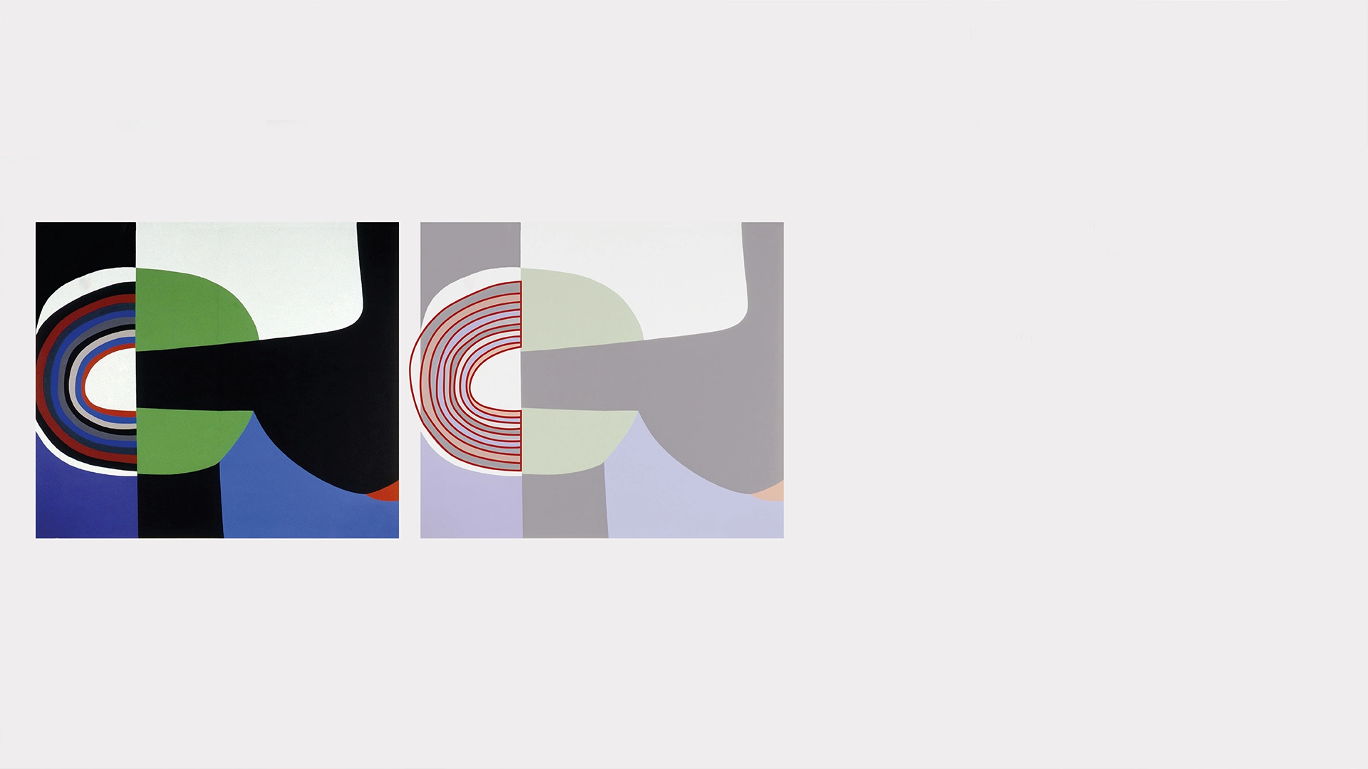
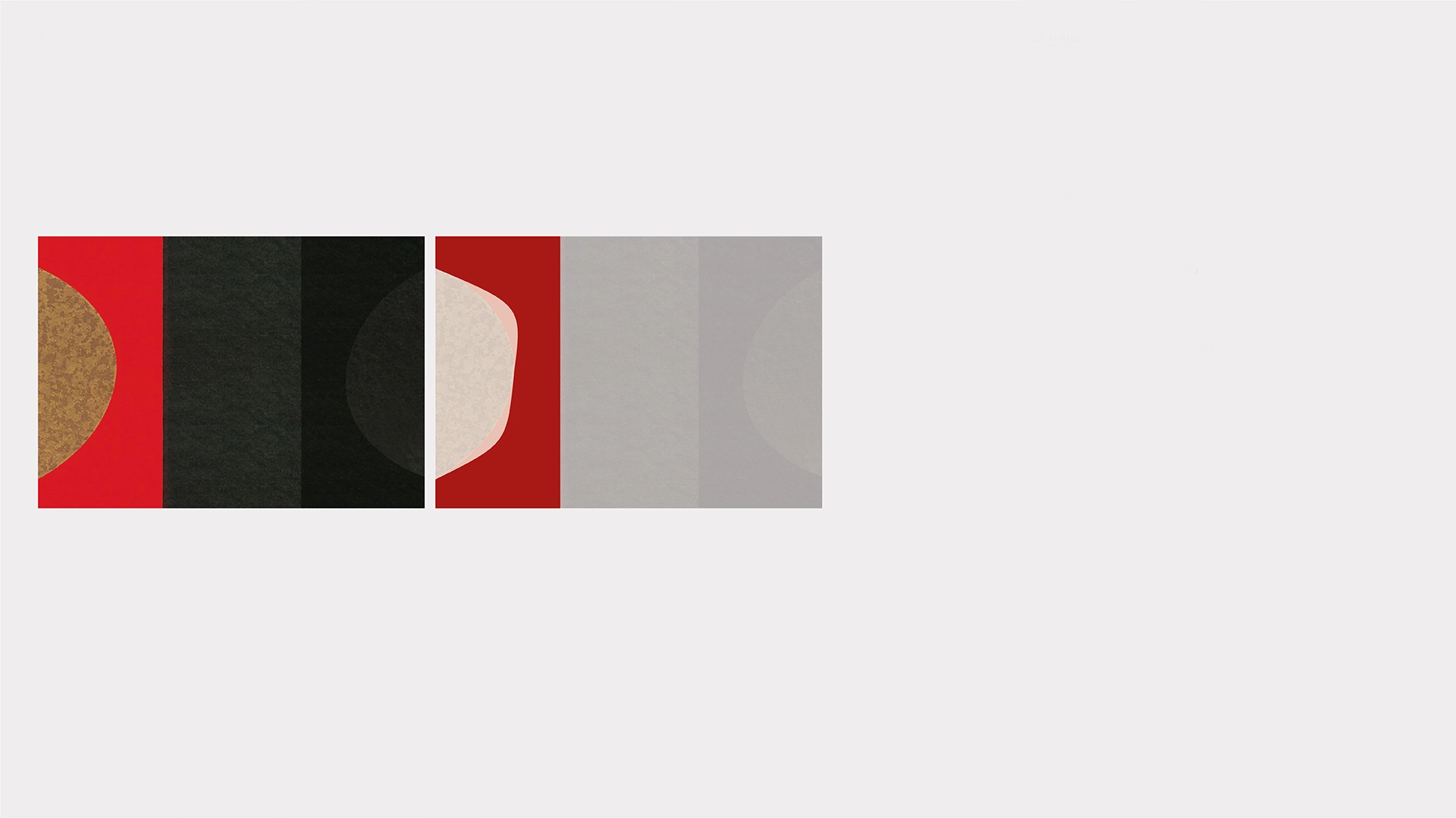
Burri’s works are approached not simply as aesthetic references, but as an archive of forms. Fragments, curves, cuts and geometries are isolated from the original compositions, simplified and reinterpreted until they become typographic elements. The artwork becomes design material.
A LANGUAGE,
NOT JUST A LOGO.
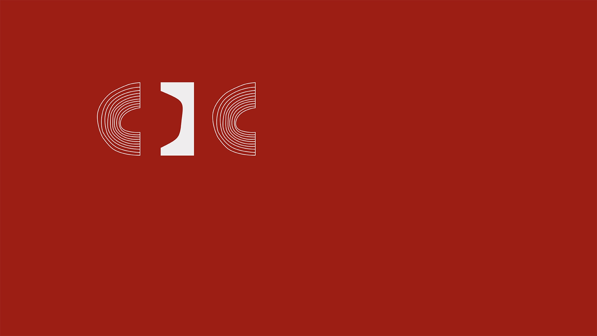
The mark expands into a family of configurations designed for different areas of civic communication, connecting the municipality, cultural heritage and public services through the same visual language.
Rather than functioning as separate identities, each configuration remains part of one recognisable system built around the CDC acronym.
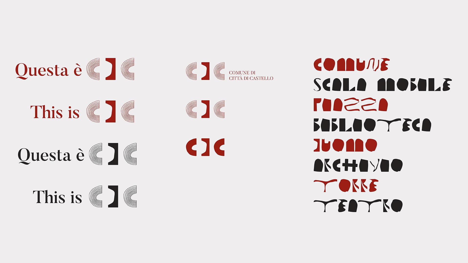
CDC Regular extends the same process into a visual alphabet of 21 uppercase letters. Each character begins with a form isolated from Burri’s work, then simplified and transformed into a glyph while retaining a visible relationship with its original composition.
The result is a typographic system in which the city’s artistic heritage becomes an active tool for contemporary communication.
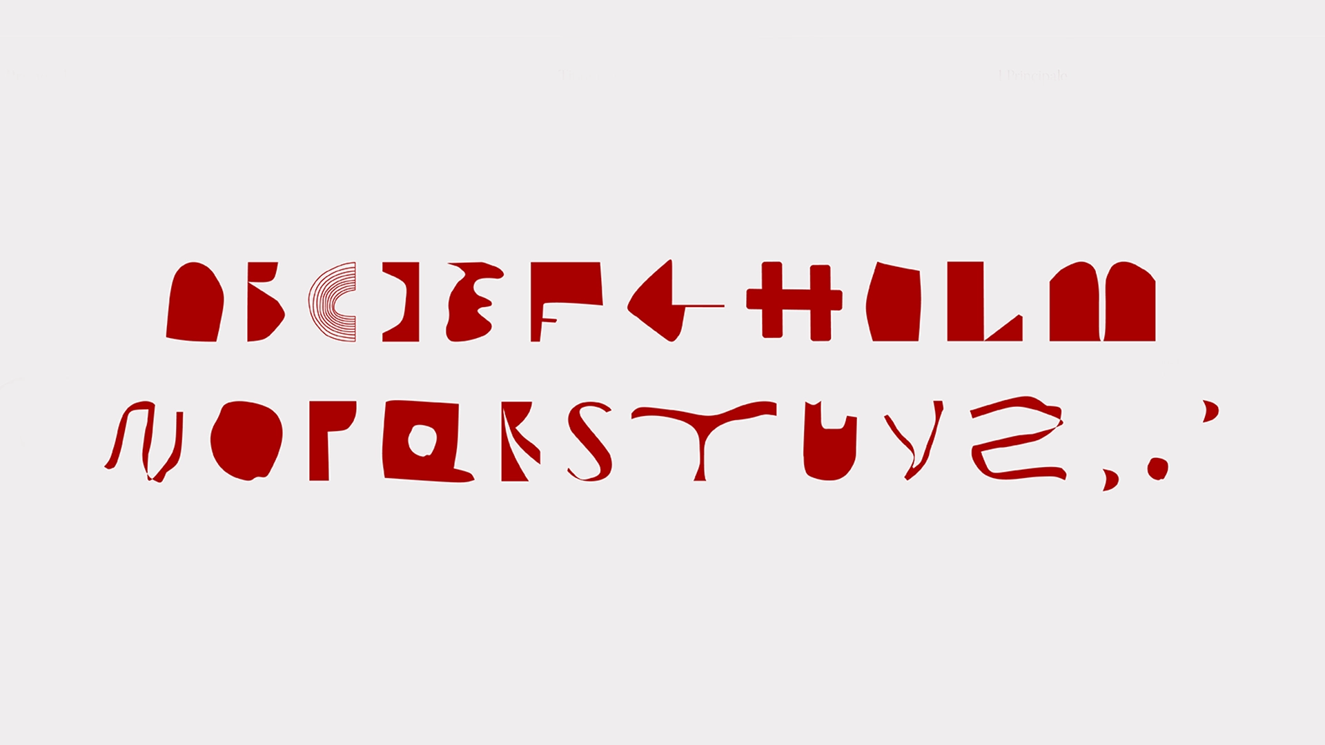
Try CDC Regular
An experimental display alphabet by Filippo Mantini. This first version includes the 21 Italian uppercase letters, space, period, comma and apostrophe.
Loading preview…
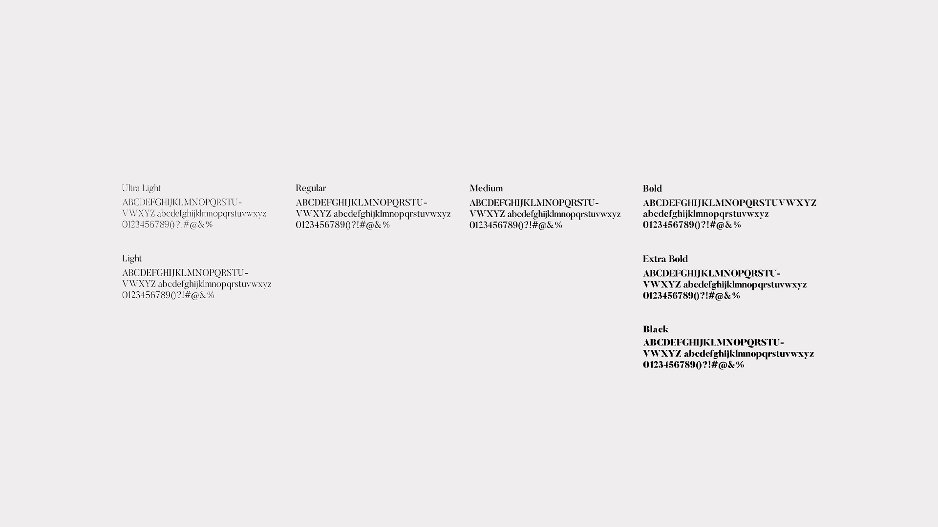
The Butler typeface completes the system, serving as the secondary typeface. Its serif structure creates a deliberate contrast with the irregular, expressive forms of CDC Regular, establishing a more institutional hierarchy for text, information and official communication.
Together, the two typefaces allow the identity to move between expression and function while maintaining a consistent visual voice.
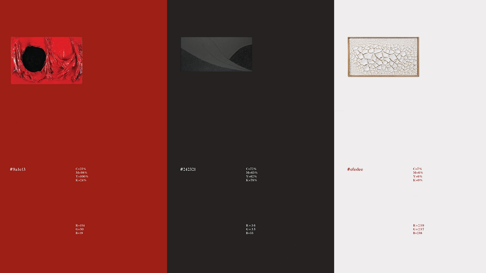
The palette brings together the artistic and institutional heritage of the city. Its colours are extracted and reinterpreted from Alberto Burri’s work, creating an essential system built around red, black and an off-white ground.
#9A1E13 acts as the distinctive colour of the identity, while #242321 provides depth and contrast. #EFEDEE is used primarily as a background and as a neutral counterpoint across the system.
CDC.
FROM SYSTEM
TO USE.
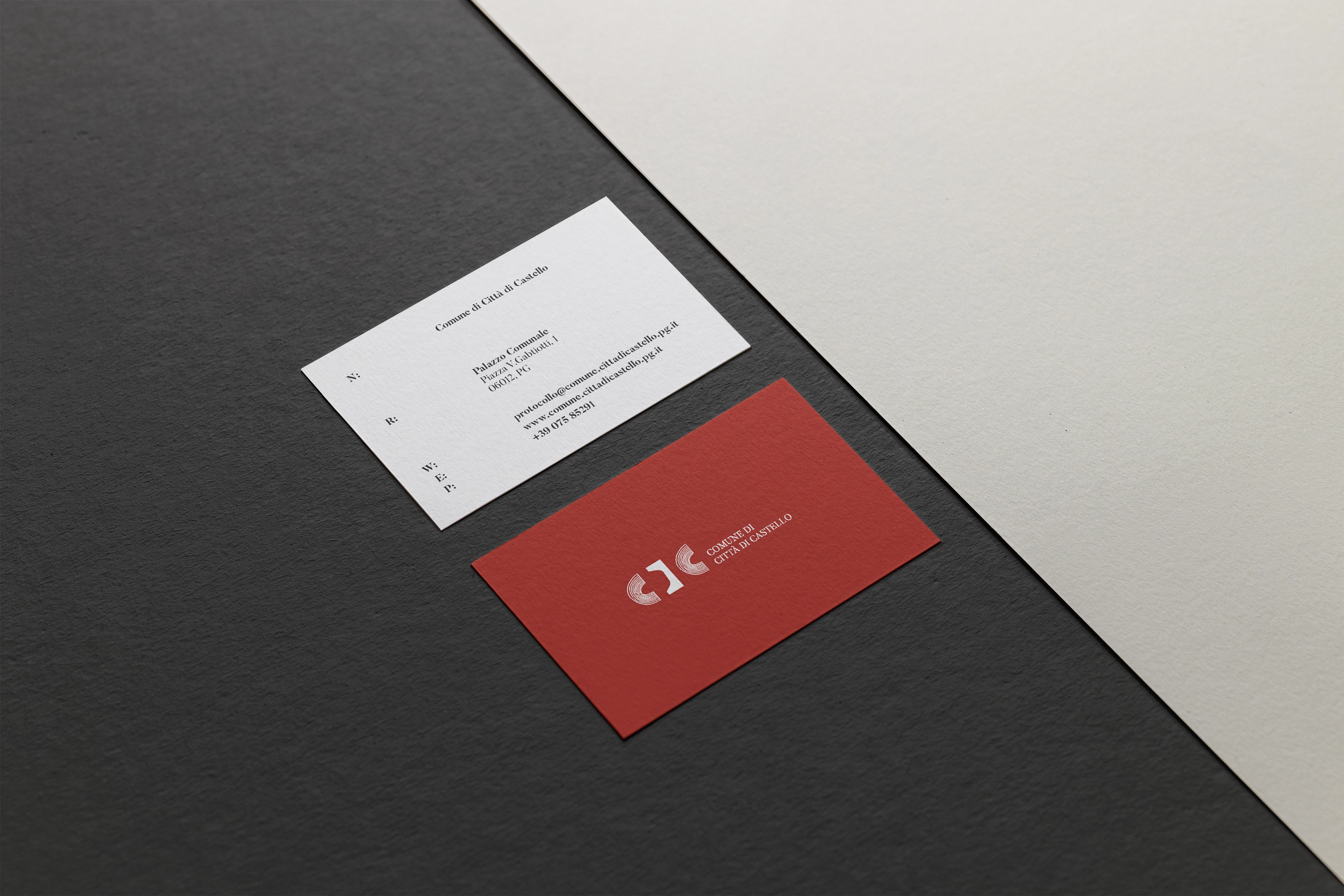
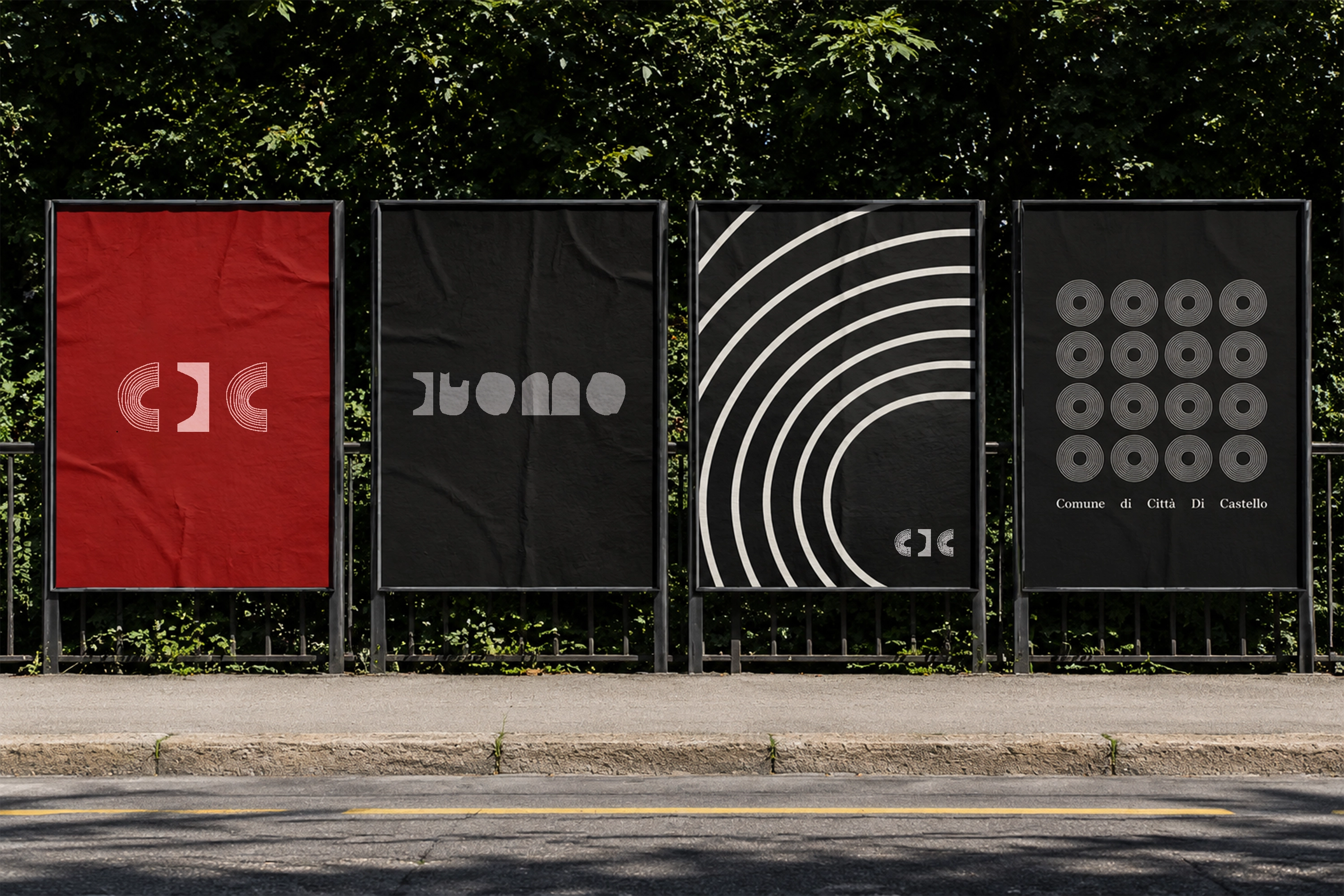
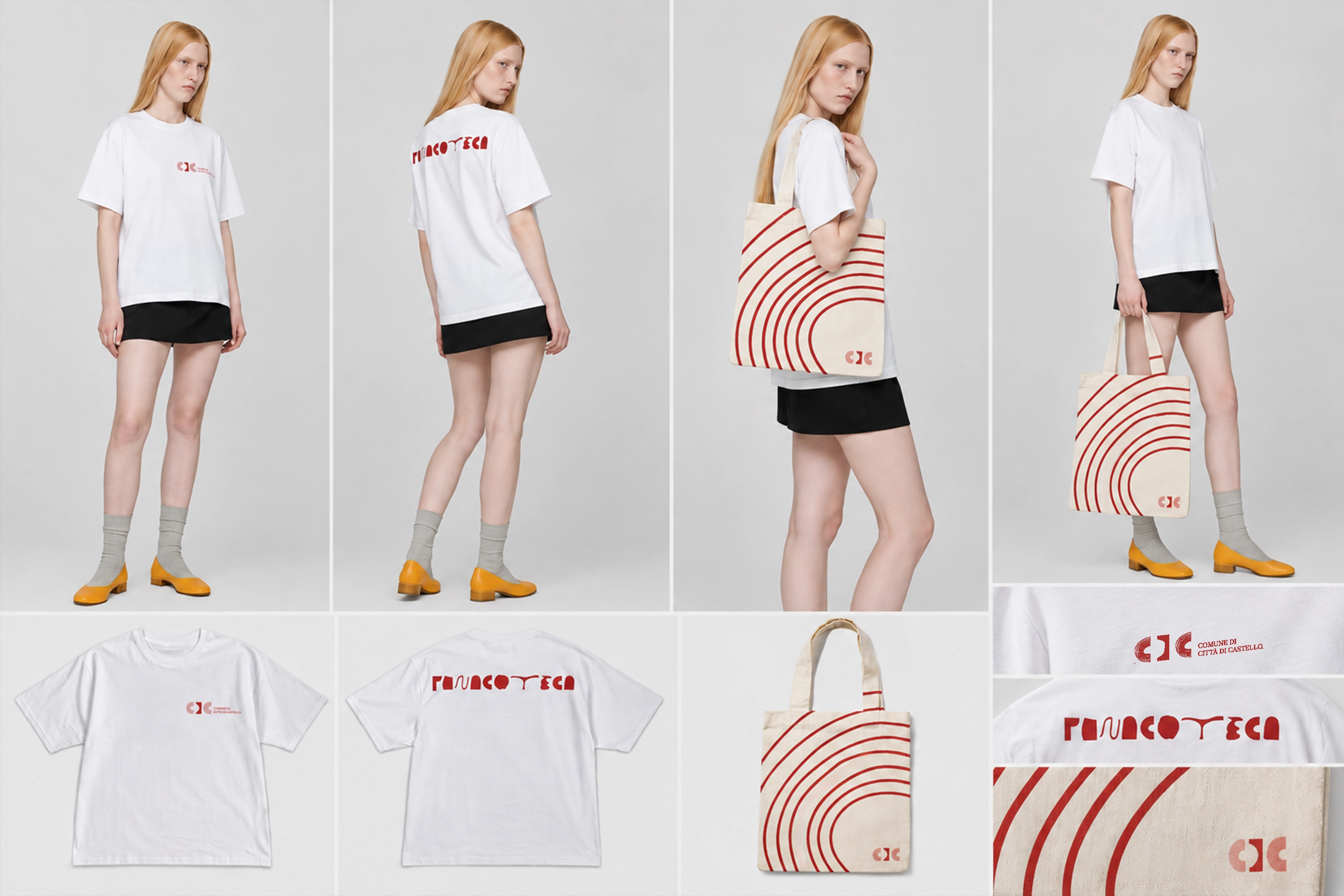
The identity moves from a graphic system into everyday institutional communication. Across printed matter and physical applications, the same visual language remains recognisable while adapting to different formats and functions.
Rather than repeating a fixed composition, the applications show how the mark, CDC Regular and the colour system can shift in scale and hierarchy without losing their relationship to the city.
PROJECT CREDITS
- Visual identity and graphic system
- Filippo Mantini
- CDC Regular type design
- Filippo Mantini
- Context
- Independent identity proposal for Città di Castello